
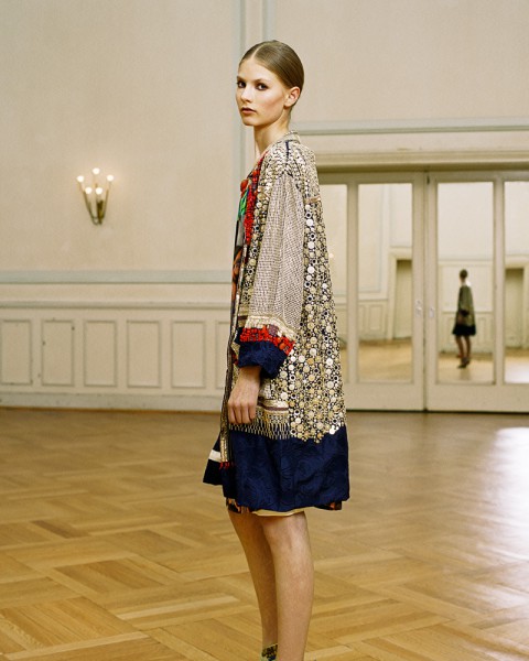
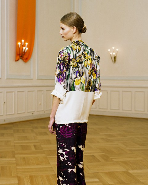
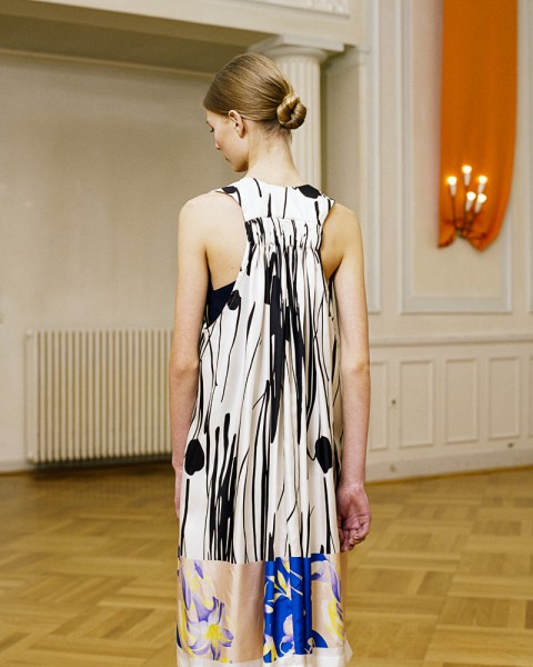
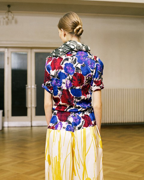
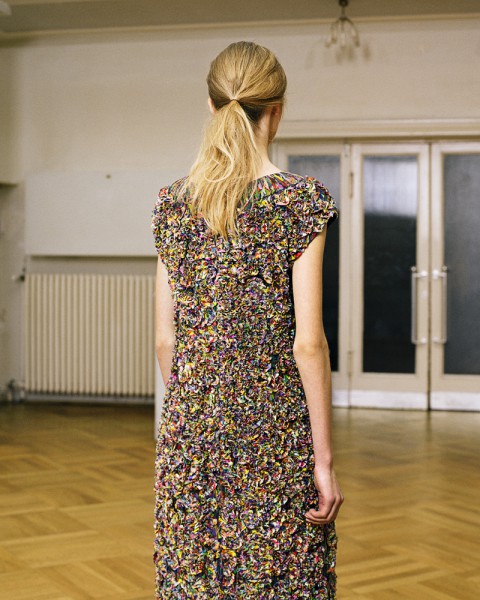
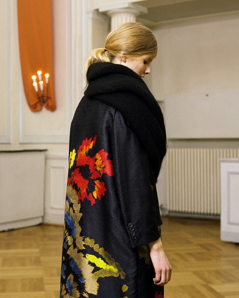
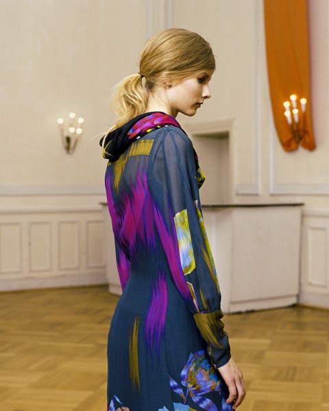
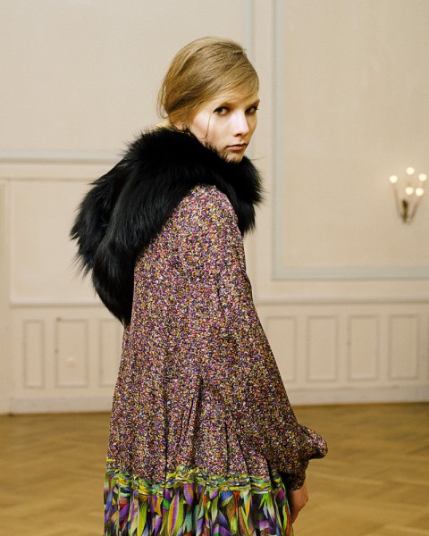
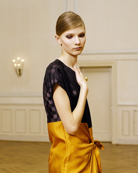
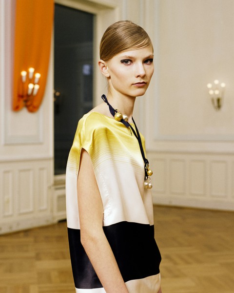
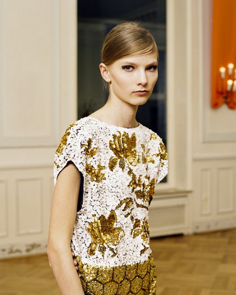
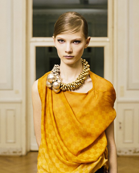
DRIES VAN NOTEN / NOTENZIRKEL / FASHION EDITORIAL
/ ART DIRECTION / PRODUCTION / PHOTOGRAPHY /
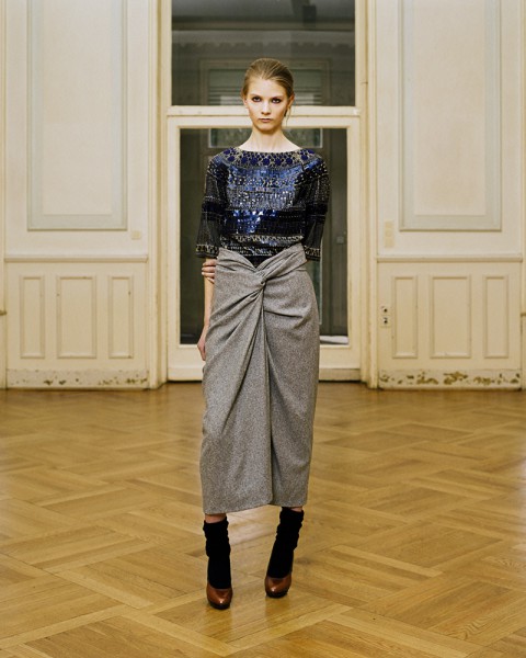
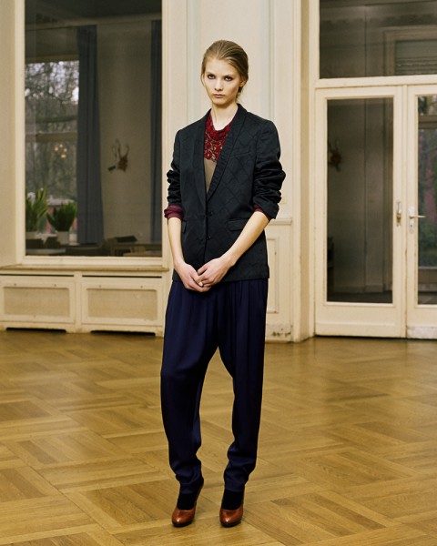
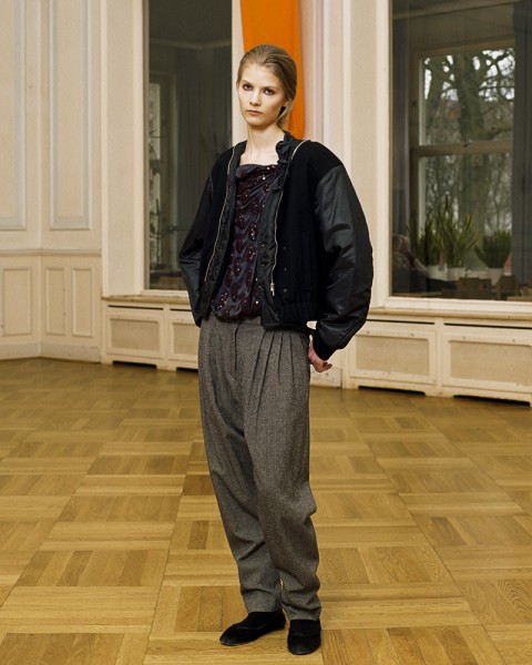
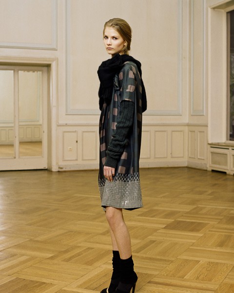
For issue #20 of mono.kultur, mono.studio had the pleasure of collaborating with Belgian fashion designer Dries van Noten, renowned not only for his distinct use of patterns, prints, and colour, but also for his gently uncompromising and thoughtful standing within the fashion industry. For the accompanying series – distilling the preceding four seasons and a turning point in the career of the designer – the camera describes a full circle during the course of the issue, slowly closing in as the interview in the magazine progresses to reveal a more intimate side of Dries van Noten.
/ Styling / Gunhild Kranz /
/ Hair & Makeup / Julie Skok /
/ Model / Camille / Nine Daughters & A Stereo /
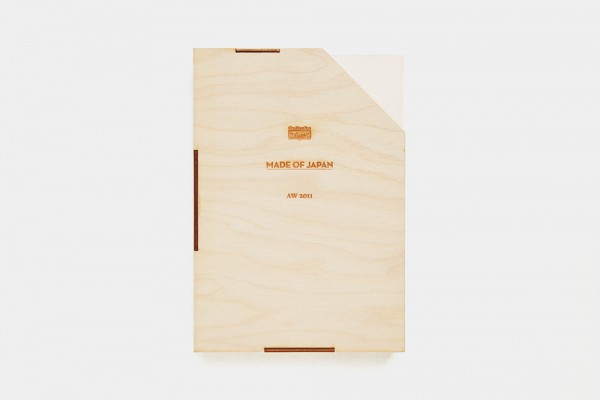
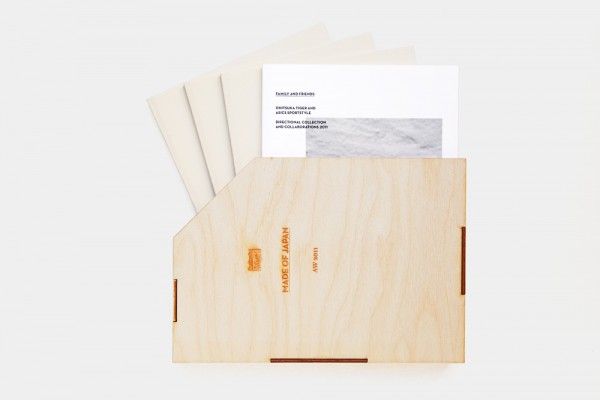
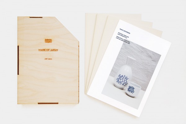
ONITSUKA TIGER / AUTUMN WINTER 2011 / LOOKBOOK
/ TEXT /
Onitsuka Tiger is the lifestyle branch of revered Japanese sports shoe company Asics, one of the oldest shoe manufacturers in Japan. As they launched the new collections for three separate lines during Berlin Fashion Week, mono.studio was asked to contribute photography and compose the introductions to the spectacular set of lookbooks.
For a brand that is so rich in history, it was a pleasure to narrate its heritage in an anecdotal way while gently placing it within a contemporary context. Needless to say, we are particularly proud of expanding Onitsuka Tiger’s tag line ‘Made of Japan’ with a surprising and hugely satisfying twist.
/ Client / Onitsuka Tiger /
/ Creative Direction / Yosuke Nishiumi /
In times of globalization and a world that is becoming smaller and smaller, we believe that it is important to remember our roots, to remind ourselves where it is we come from, what it is that makes us special. For us at Onitsuka Tiger, we are fortunate that we do not have to look far: We are made of Japan. But we are open to the world.
When founder Kihachiro Onitsuka designed the epic OK Basketball Shoe more than 60 years ago in a small shoe shop in Kobe, Japan, he not only laid the foundation for what would turn into the global sports fashion brand Onitsuka Tiger as you know it. He also laid the artistic and creative foundation that drives us until this very day: the OK Basketball Shoe featured innovative suction cups on the soles that were inspired by an octopus stuck to Kihachiro’s dinner plate.
It is this sharp eye for our surroundings and culture, coupled with creativity and an acute sense for detail and quality that still lives on in every product by Onitsuka Tiger sold today. Crafted with refined Japanese materials and tradition, our products are created in accordance to the highest Japanese production standards and assembled into original designs, fusing the arts and culture of the East with the seductive urban design styles of the West. It is made of Japan, and we made it for you.
ONITSUKA TIGER AISEN COLLECTION / AUTUMN WINTER 2011 / LOOKBOOK
/ TEXT /
/ Client / Onitsuka Tiger /
/ Creative Direction / Yosuke Nishiumi /
Ever since our founding father Kihachiro Onitsuka had the idea for his very first basketball shoe in examining an octopus, we’ve known that sometimes you don’t have to look very far to find an answer to your question. You only have to listen closely. To observe carefully. You only have to be curious.
And so we did not have to look very far for the inspiration of our new range AISEN. AISEN is derived from the Japanese words AI as in indigo and SEN as in dye. The natural materials for our AISEN foot wear collection are dip-dyed by hand, according to a traditional Japanese method that uses the pigment of indigo plants to create subtle shades of blue.
AISEN is alive: all indigo dyed textiles are unique in hue and colour; they breathe, change and develop over time. It is that which makes AISEN special. It is an idea we love, because it reminds us of the Japanese philosophy of WABI SABI celebrating the beauty of imperfection.
And so we are proud to present to you the second collection of AISEN. It is made of Japan, and we made it for you.
ONITSUKA TIGER KOBE COLLECTION / AUTUMN WINTER 2011 / LOOKBOOK
/ TEXT /
/ Client / Onitsuka Tiger /
/ Creative Direction / Yosuke Nishiumi /
Onitsuka Tiger was founded in Kobe in 1949, and we have been based in Kobe ever since. Kobe is our hometown. Without Kobe, Onitsuka Tiger would not be the company it is today. And so we thought it is about time we give something back to the city that has nurtured us for so long. And what better way to give back than sharing?
Kobe, of course, is, among so many other things, famous for its leather. Onitsuka Tiger is famous for its sneakers. And so, like 1 and 1 makes 2, we proudly present to you our new sneaker collection KOBE. Using the finest leather hides from Kobe farms, and Kobe farms only. And we mean premium leather here, crafted and tanned and finished in Kobe. For sneakers created and designed and produced in Kobe. You cannot imagine how excited we are about this one.
We hope you will treasure the KOBE range, because this one comes from close to our heart: this one comes from home. It is made of Japan, and we made it for you.
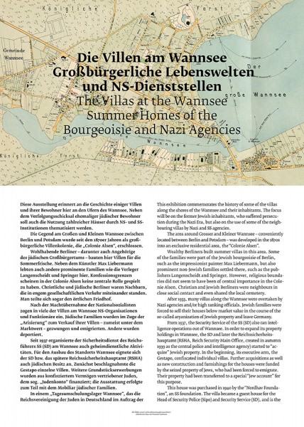
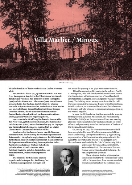
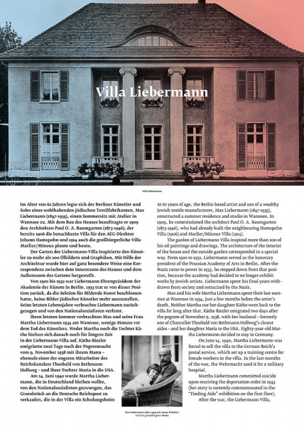
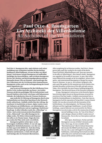
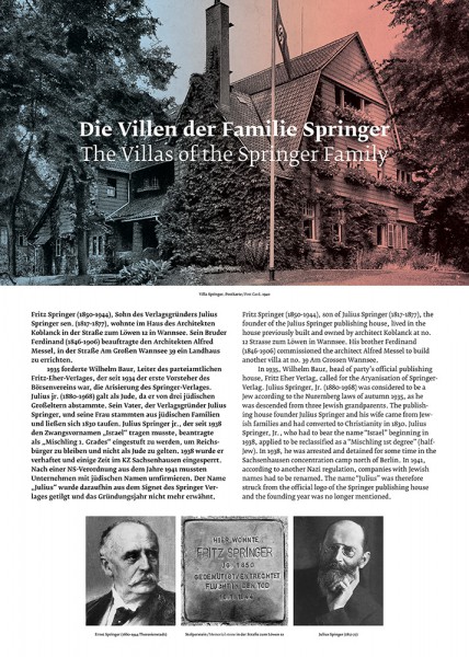
WANNSEE VILLA / GARDEN EXHIBITION
/ EXHIBITION DESIGN /
The Wannsee Villa is a beautiful villa with lush gardens sloping down to the shores of the picturesque Wannsee in Berlin. But it comes with a dark history: in 1942, it housed the notorious Wannsee Conference, when the technicalities of putting the ‘final solution’ into practice were decided. The villa is now a memorial and museum.
To welcome guests in the courtyard during the busy summer months, we designed the displays for a temporary garden exhibition on the troubled history of the Wannsee, a wealthy neighbourhood with splendid villas – many of which belonged to Jewish families and were misappropriated by the Nazi regime. Underpinning a timeless, classic design, we developed a colour scheme of red versus blue to signify a Nazi and/or Jewish history of the buildings.
/ Client / Haus der Wannsee-Konferenz /
/ In Collaboration with / Gila Kaplan /
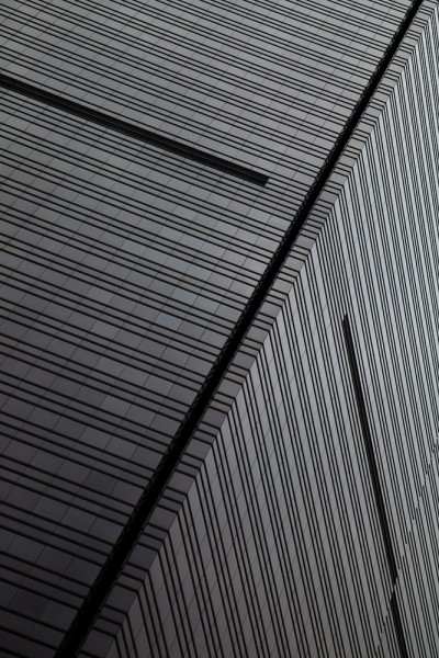
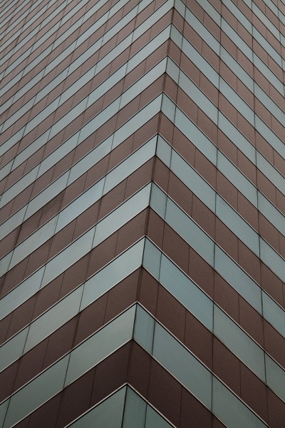
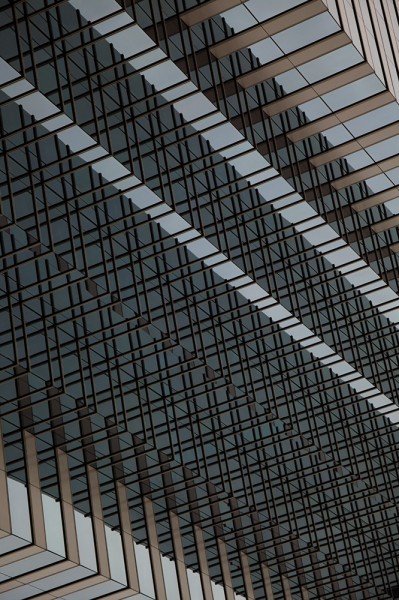
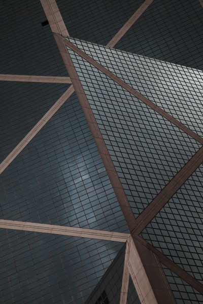


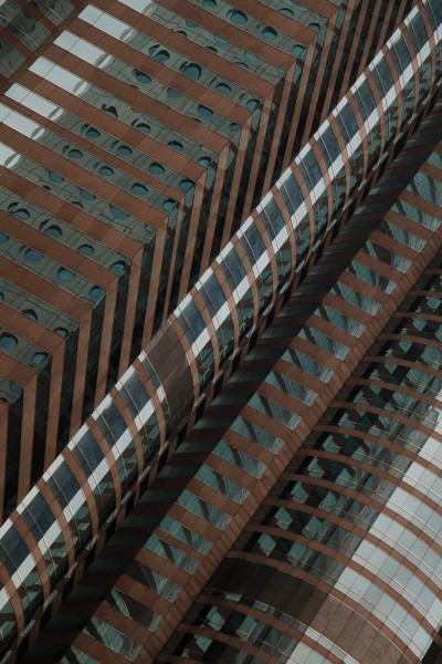
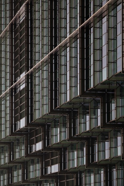

PARALLEL LINES (…THAT SHOULD HAVE NEVER CROSSED)
/ PHOTOGRAPHY /
As a studio devoted to telling stories that make sense of our contemporary world, we frequently initiate projects that go beyond commissioned assignments.
‘Parallel Lines’ is a photographic series capturing a general sense of unease in the wake of the financial crisis of 2008 that exposed the underlying power structures of our modern societies. The photographs depict the outside facades of the Hong Kong headquarters of the world’s 25 largest banking corporations, all housed in close vicinity to one another and on the edge of one of the largest emerging markets that has become synonymous with a global power shift. Taken from street level, the images describe a dizzyingly seductive and influential world that is inaccessible and intimidating to most, and yet it impacts our everyday lives in a complex and intimate manner.
The series was exhibited in Berlin in 2012 and 2013.
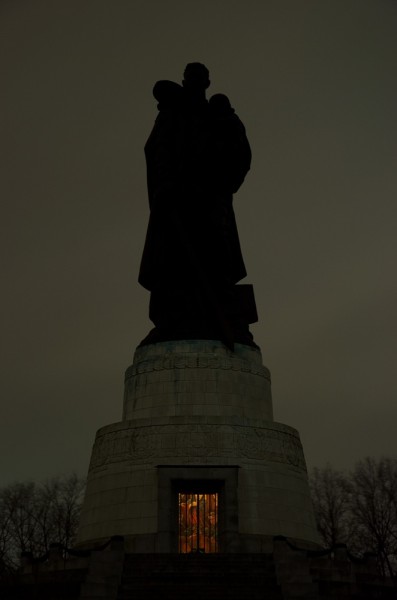
HUGE MAGAZINE / STORYBOARD BERLIN #01 / SOVIET WAR MEMORIAL / EDITORIAL
/ TEXT / PHOTOGRAPHY /
For the Japanese style bible Huge, mono.studio was asked to cover, in writing and photography, the German end of a rotating monthly column reporting on London, New York, and Berlin. The suggestion was to introduce a subjective selection of places beyond the trodden paths of guide books. Instead, we offered a highly personal view of very common places and moments, and how they define our lives in the city we love so very much.
/ Publication / Huge /
Berlin-based artist Cyprien Gaillard once argued that architecture can be experienced at its best in a state of sullen hang-over, and ever since I dragged some visiting friends along to the Soviet War Memorial for a freezing Sunday’s winter walk with a sharp headache and much too little sleep behind us after a long night, I tend to agree.
We had walked through East Berlin’s Treptower Park and came up the steps to the memorial, flanked by two kneeling soldiers hoisting up granite Soviet flags, when we had our moment: The ridiculously oversized field of tombstones came into sight, crowned by the literally gigantic statue of the soldier – carrying a child on his left, a sword in his right, with a crushed swastika underfoot – silhouetted against the sky while darkness fell. It was kind of awe-inspiring and absurd at the same time. It was a magic moment.
Berlin, of course, embodies Europe’s troubled past of the 20th century like no other, traces of which can be found all over the grey city – most obviously in the architecture and countless monuments from different eras, not seldom cause for controversy, demonstrating the city’s uneasy relationship with its own unwelcome heritage. While the Fascist era has its most dramatic architectural embodiment in the 1936 Olympic Stadium on the western side of the city, the Soviet War Memorial might be its Communist counterpart, and a case in point as to how similar the imagery of the two opposing ideologies actually was.
Imposed in 1949 on the East German government by the Soviet Union as a memorial and cemetery to some of the 80,000 fallen Russian soldiers during the Battle of Berlin, the Soviet Monument has never been popular with East Berliners, and today it is fortunately largely ignored. Which makes it a great place to go and think, as it’s mostly deserted and windswept, in a soothing kind of way. The magic moment never fails to impress – particularly on a cold and rainy winter evening with a severe hangover.
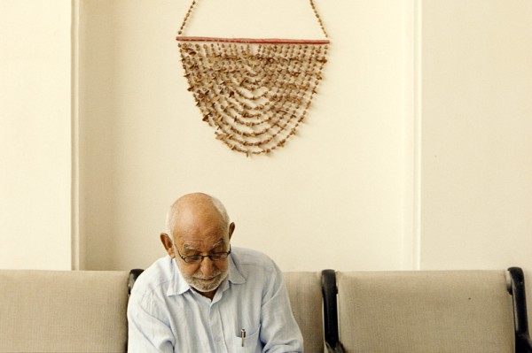
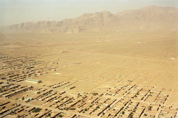
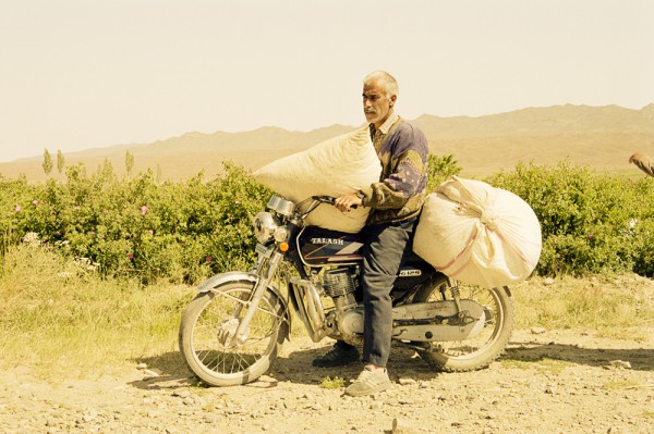
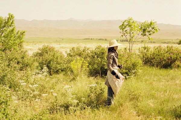
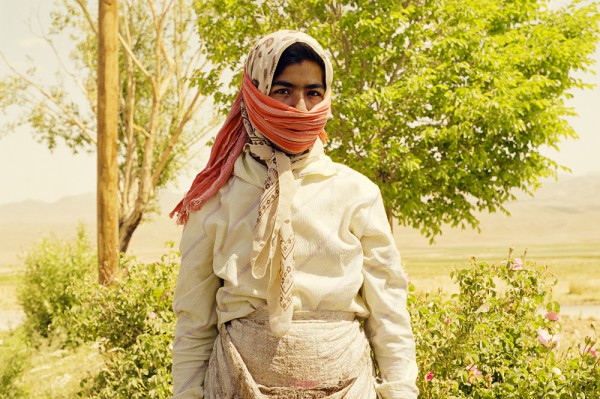
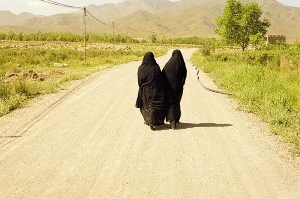
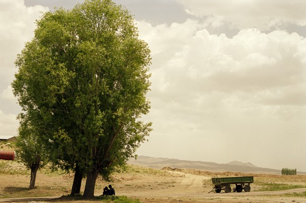
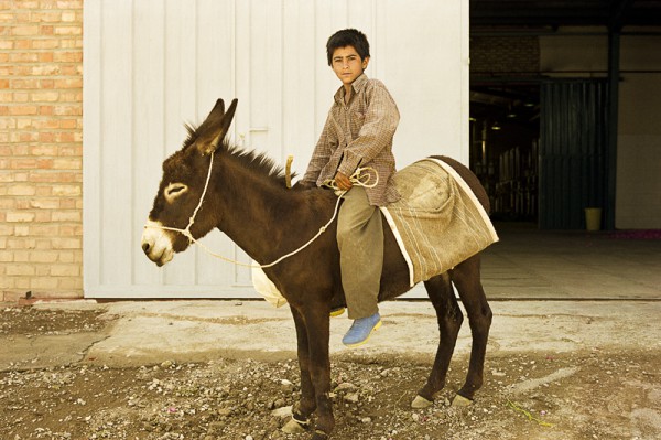
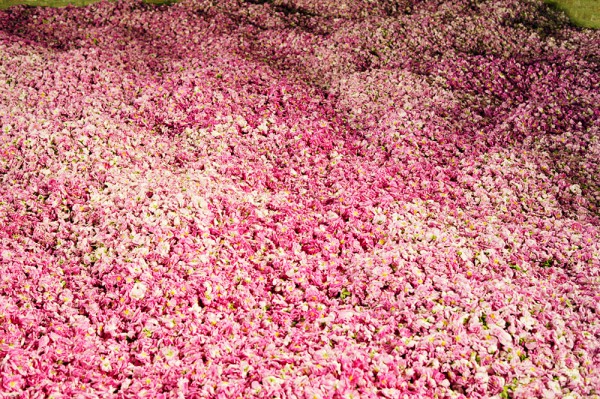
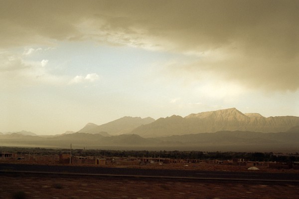
PORT MAGAZINE / IRANIAN ROSES / EDITORIAL
/ PHOTOGRAPHY /
We did not hesitate for a moment when we were invited by cosmetics company Dr. Hauschka to accompany them on a trip to Iran and portray an entrepreneur of a different cloth, Mr. Homayoun Sanati. Originally a bazaar trader turned translator and publisher of American school books, Mr. Sanati had inherited acres of land in the mountains of Kerman, bare due to the dry climate and largely used to grow opium. With no background in agriculture but a healthy dose of determination and stubbornness, Sanati went a different path and experimented with roses instead. Despite initial hostility and several years’ imprisonment after the Iranian Revolution, he miraculously succeeded in creating a flourishing international enterprise, inspiring farmers in the entire region to turn from opium to roses.
/ Client / Dr. Hauschka /
/ Publication / Port /
JAMES NACHTWEY / SHARDS OF TIME / EDITORIAL
/ TEXT /
It took us nearly two years to publish mono.kultur #37 with and about legendary war photographer James Nachtwey, but in exchange, it turned out to be an extremely rewarding issue. Striking a precise balance between words and images and extracting the subtle shades of grey in a profession that is all too easily judged as black and white, was a challenge that turned into a pleasure while collaborating closely with an experienced journalist such as James Nachtwey.
James Nachtwey defies all preconceived notions one might have of a war photographer. When we meet in Paris, I find myself sitting opposite a calm, composed and slightly reserved man who at the same time seems to radiate curiosity, enthusiasm and warmth that is as striking as it is unexpected. He speaks slowly with a reassuring, rolling bass, carefully weighing his words and frequently taking long pauses to think. If anything, it is the quiet intensity of his concentration and his alert presence that indicate what Nachtwey has dedicated his life to: to document the wars and catastrophes of our times.
While seeking to reach as many people as possible with his photographs, Nachtwey himself does not like to be the center of attention. Preferring to let the images speak for themselves, he rarely takes the time to talk about his work, let alone his experiences of war. And yet he is one of the most prominent contemporary photojournalists, published in the most prestigious magazines and newspapers, awarded countless times for his work.
There are many contradictions to Nachtwey and his work that are difficult to grasp. After all, for more than 30 years Nachtwey has been photographing the suffering and calamities that we humans have inflicted on each other, in images that are neither easy to look at nor easy to forget – and yet he appears, unlike many of his colleagues, unscathed by what he has seen and experienced. Not untouched, but without bitterness, at peace.
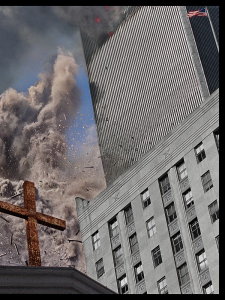
Nachtwey’s body of work could also be read as a trajectory of global conflict – from the troubles in Northern Ireland in the early 1980s to the revolutions in South and Central America, from the collapse of Communism to the famines of Africa in the 1990s, again and again the spiraling conflict between the Muslim and the Western worlds, from Israel to 9/11 to the war in Iraq.
James Nachtwey has often described himself a witness, but also as someone who has been trying to disappear. It is the paradoxical challenge at the heart of photojournalism: how to observe and yet engage, to be fully present and remote at the same time, to take us closer but also stand a step back. And, indeed, Nachtwey’s images are so immediate that it is sometimes inconceivable that he was actually there. It feels like we are looking at life itself rather than a picture of it. Like we are hearing the voices of people who cannot make themselves heard.
His photographs depict scenes of war, but they rarely show the activity of war, the fighting. Instead, they describe the damage of violence: the loss and the scars. They are overtly political, but on a human and thus universal scale. They don’t deny complexity, but translate it into a language that we can all understand. His images show destruction and suffering, and yet they mysteriously distill a sense of hope and beauty. They speak with an urgency and integrity that are as compelling as they are demanding: By exposing us to our weakest and darkest impulses, they tell us that we can do better. By forcing us to confront our failures, they hold us to our beliefs and morality. They acknowledge, but they don’t accept.
James Nachtwey has devoted his life to a cause rather than a profession, driven by the sheer momentum of conviction and compassion. And maybe it is this clear sense of purpose and his unwavering belief in the power of images that keep him going ever forward where most of us would naturally retreat, that force him to address what we would prefer to ignore.
There is no doubt that Nachtwey’s images are a challenge – to the powers that be by proposing an unflinching look at the reality on the ground, at the effects of politics on human lives, but also to us as their audience, by questioning our implication and, quite simply, by opening our eyes to the world.