
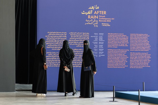
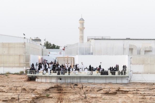
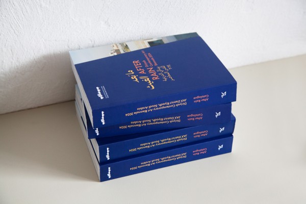
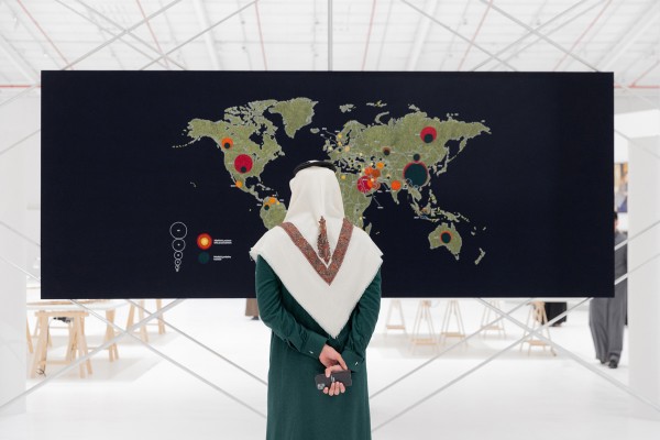
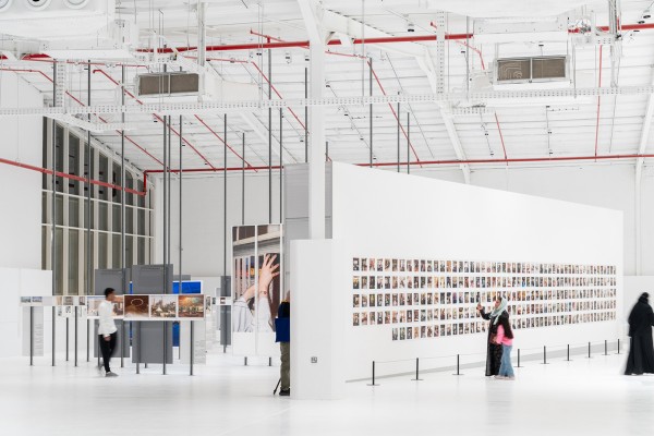

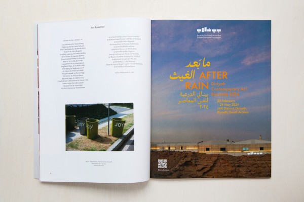
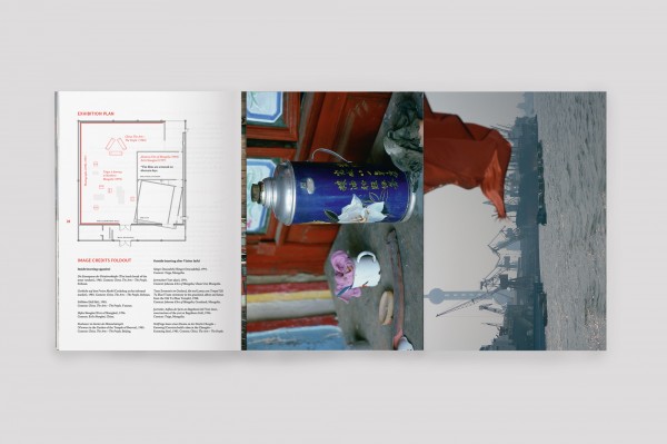
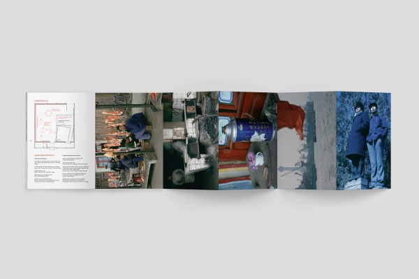
DIRIYAH CONTEMPORARY ARTS BIENNALE 2024: AFTER RAIN
/ ART DIRECTION / DESIGN /
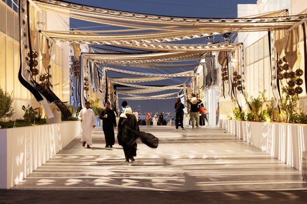
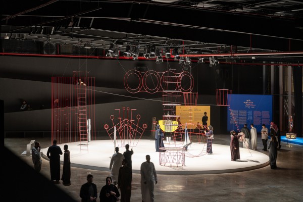
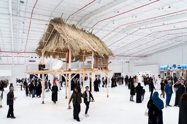
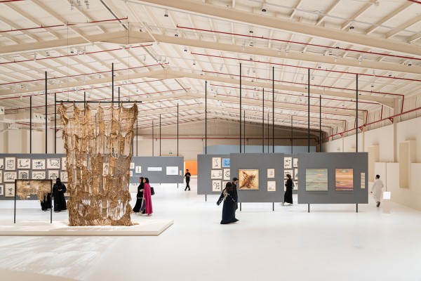
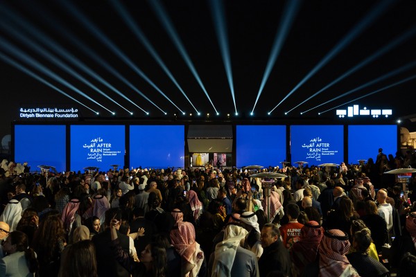
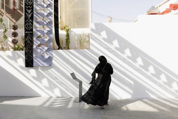
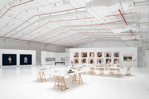
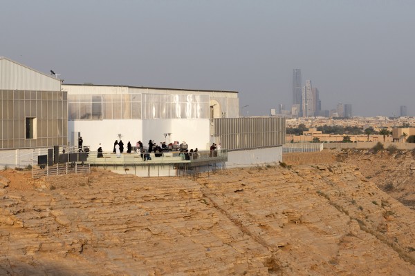
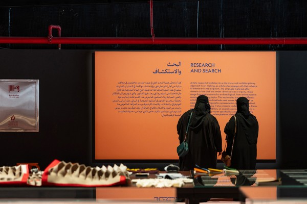
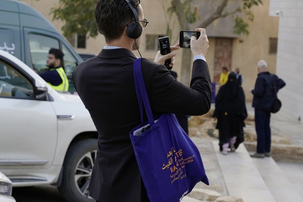
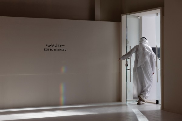
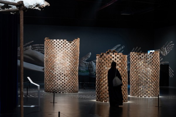
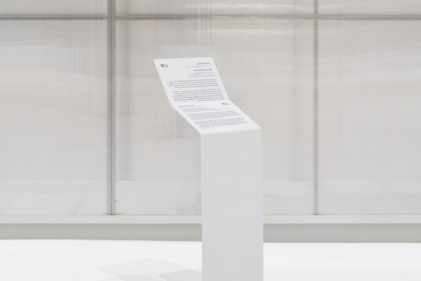
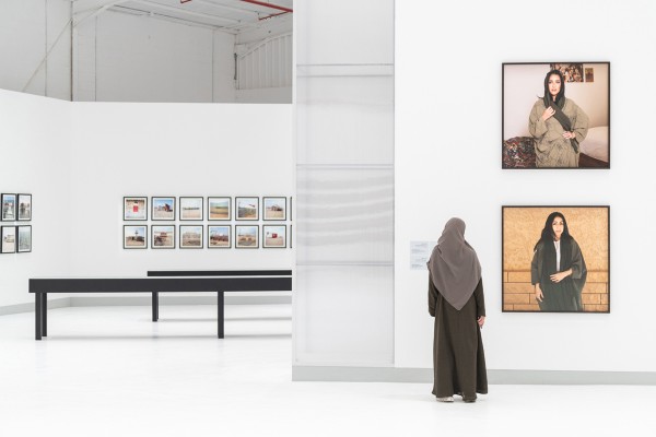
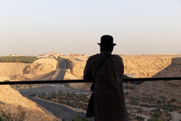
For the second edition of the Diriyah Contemporary Art Biennale, based on the edge of Riyadh in Saudi Arabia, we were invited to develop the overall identity and accompanying materials, including the logo and identity design, signage, two catalogues, advertising campaigns, an associated website, banners, and a broad range of collaterals.
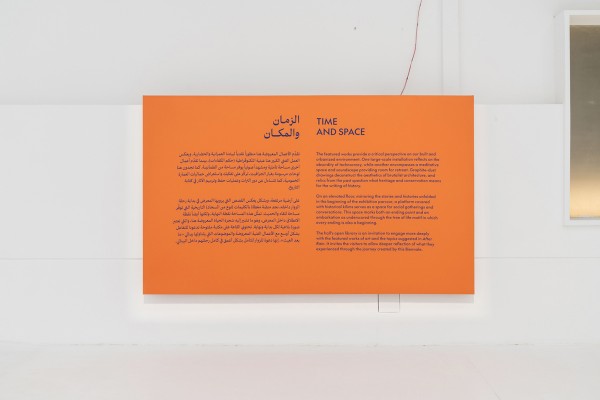
Featuring over 100 artists from the Gulf Region and beyond, the Biennale was developed in the spirit of dialogue and open-mindedness, with a focus on trying to understand and unravel the geographic, historical, and cultural particularities of the region. It addressed topics such as the meeting of cultures in a time of transition, the exchange of knowledge across regions, traditions, and genres, the interaction between societies and the environment, while putting a strong emphasis on international artists visiting the country and encouraging a practice of sharing knowlegde and time.
The identity attempts to reflect these narratives by a playful interlocking of English and Arabic typography, and bright colour palette reminiscent of a nocturnal society, and compositions that merge an organic fluidity with sharp edges and cuts.
/ Commissioned by / Diriyah Biennale Foundation /
/ Artistic Director / Ute Meta Bauer /
/ Co-Curators / Rose Lejeune, Wejdan Reda, Anca Rujoiu, Ana Salazar Herrera / Adjunct Curator / Rahul Gudipudi /
/ Artists / Hamra Abbas, Jumana Emil Abboud, Sara Abdu, Irene Agrivina, Alia Ahmad, Azra Akšamija,Nabila Al Bassam, Tara Aldughaither & Joe Namy, Rasha Al-Duwaisan, Mohammad AlFaraj, Dhali Al Mamoon, Reem Al Nasser, Daniah Alsaleh, Abdulrahman Al-Soliman, Nazgol Ansarinia, Rasheed Araeen, Siah Armajani, Andrius Arutiunian, Martha Atienza, Tarek Atoui, Dana Awartani, Asma Bahmim, bahraini—danish, Sammy Baloji, Zarina Bhimji, Ursula Biemann, Safeya Binzagr, Rossella Biscotti, Bricklab, Britto Arts Trust, Muhanned Cader, María Magdalena Campos-Pons, Cercle d’Art des Travailleurs de Plantation Congolaise, Rachaporn Choochuey, Tiffany Chung, Ade Darmawan, Priyageetha Dia, Vikram Divecha, Ibrahim El-Salahi, Alexander Eriksson Furunes & Sudar Khadka, Alia Farid, Christine Fenzl, Ângela Ferreira, Simryn Gill, Anne Holtrop, Hiba Ismail, Saodat Ismailova, Joan Jonas, Susanne Kriemann, Liang Shaoji, Armin Linke & Ahmed Mater, Liu Chuang, Mariah Lookman, Nidhi Mahajan & Moad Musbahi, Taus Makhacheva, Robin Meier Wiratunga, The Migrant Ecologies Project, Malgorzata Mirga-Tas, Regina Maria Möller, James Morris, Tania Mouraud, Zarina Muhammad, Dala Nasser, Hind Nasser, Hussein Nassereddine, Filwa Nazer, Nguyên Trinh Thi, NJOKOBOK, Elia Nurvista, Phi Phi Oanh, Lucy + Jorge Orta, Jorge Otero-Pailos, Sopheap Pich, Marjetica Potrc, Lala Rukh, Arin Rungjang, Tomás Saraceno, Citra Sasmita, Seher Shah, Hassan Sharif, Shooshie Sulaiman, syn architects, Tang Da Wu, Paulo Tavares / autonoma, TAYYUN, Sissel Tolaas, Anaïs Tondeur, Mona Vatamanu & Florin Tudor, Suzann Victor, Munem Wasif, Ines Weizman, Jana Winderen, Yang Fudong, Yeo Siew Hua, Liam Young, Camille Zakharia, Samia Zaru, Feifei Zhou /
/ Scenography / Laura Miotto, Savina Nicolini /
/ Editorial Lead / Laura Schleussner /
/ Design Assistance / João Pedro Costa, Linda Riedl
/ Arabic Typography / bytwo /
/ Exhibition Photography / Marco Capelletti, Alessandro Brasile /
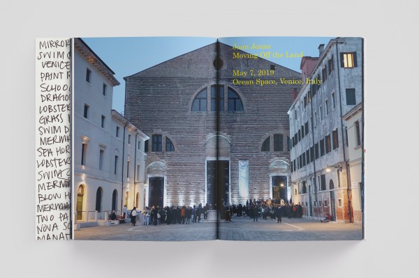
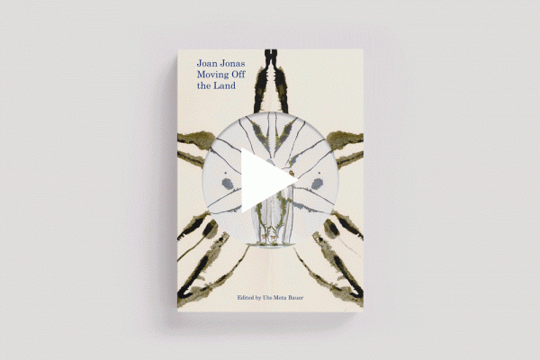
TBA21 / JOAN JONAS: MOVING OFF THE LAND
/ ART DIRECTION / DESIGN /
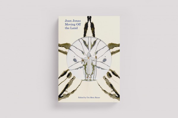
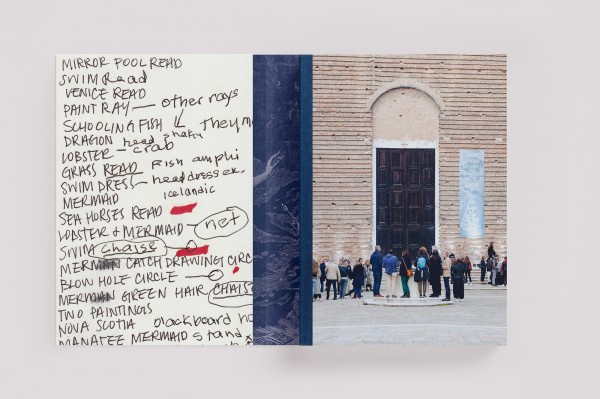
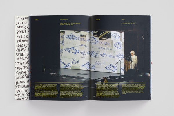
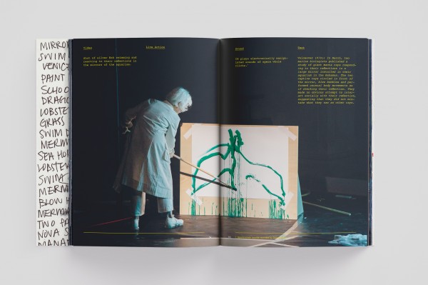
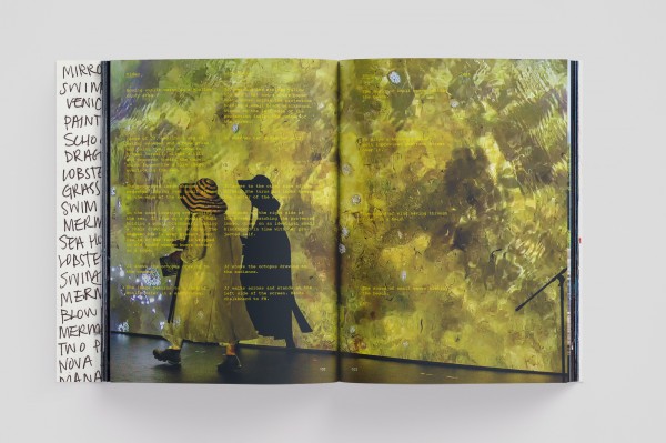
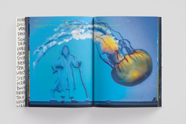
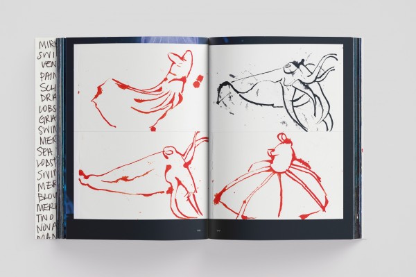
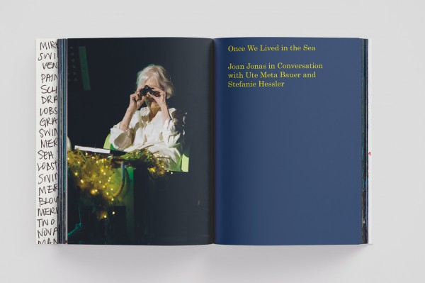
Joan Jonas: Moving Off the Land documents the performance of the same title by seminal American artist Joan Jonas, which concerns itself with the state of the ocean and the impact of mankind on the environment. As so often with Jonas, the piece started as an annotated lecture and developed, over many years and iterations, into a rich and layered performance piece, combining video, live sound, fragments of text, painting, personal stories, and movement.
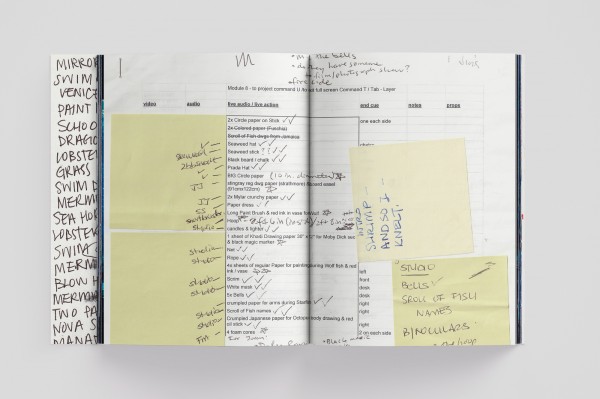
For the book, Jonas gave us unprecedented access to her archives, including scribbles and notes, personal photographs, technical instructions, fragments of scripts and writings, as well as hundreds of drawings, that give a rare glimpse into the artist’s process of thought and research. We translated the density of the piece by working on a horizontal plane – a full documentation of the entire performance in Venice in 2019 – and a vertical axis – the related reference materials inserted and layered in position. And so the book chronicles a very specific performance while also presenting a unique case study of Jonas’ universe and working process.
/ Commissioned by / TBA 21 /
/ Artist / Joan Jonas /
/ Editor / Ute Meta Bauer /
/ Publisher / Verlag der Buchhandlung Walther und Franz König /
/ Printers / Grafiche Veneziane /
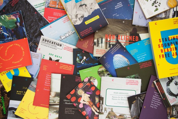
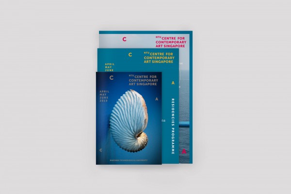
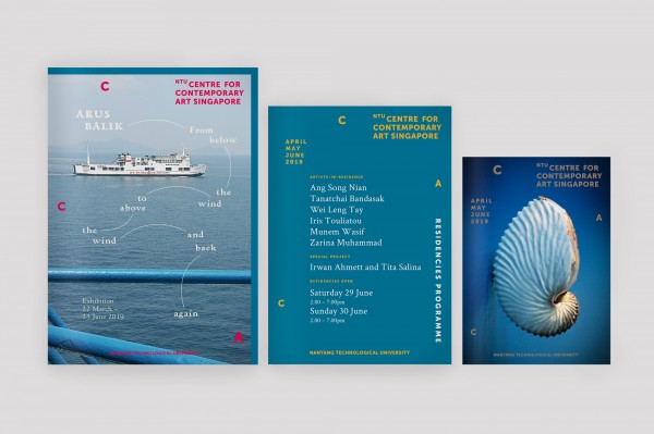
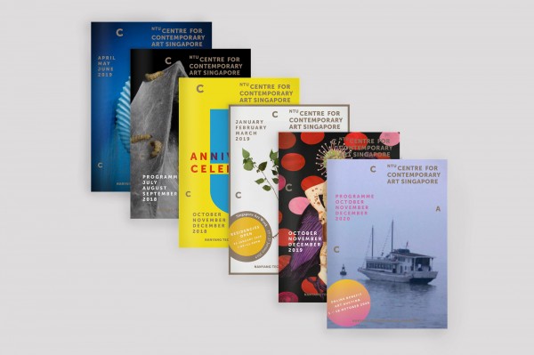
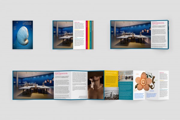
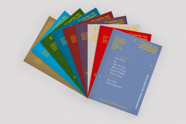
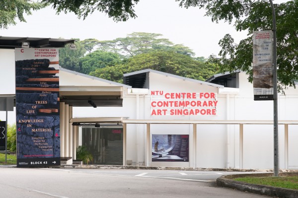
NTU CCA SINGAPORE / COLLATERALS AND IDENTITIES
/ ART DIRECTION / DESIGN /
A leading international art institution, NTU CCA Singapore is a research centre for art, culture, and science of Nanyang Technological University. Since its founding in 2013, it has been gathering strands of academic research and artistic production under its three-fold constellation of Exhibitions, Residencies, and Research and Education.
Since 2017, mono.studio has accompanied the exhibitions programme at NTU CCA Singapore, developing unique visual identities for each presentation, as well as books, programmes, and other related collaterals. In 2018, we applied a modular system to the institute’s entire printed output to provide a consistent structure within their given graphic identity, redesigning along the way the regular programmes for the Exhibitions and Residencies departments.
/ Client / NTU Centre for Contemporary Art Singapore /
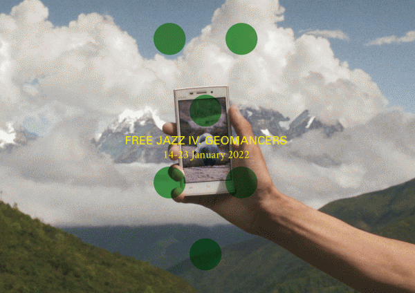
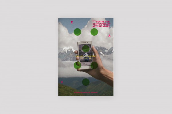
NTU CCA SINGAPORE / FREE JAZZ IV. GEOMANCERS
/ ART DIRECTION / DESIGN /
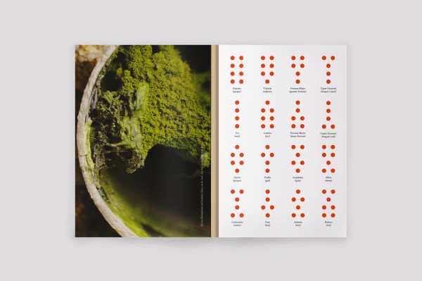
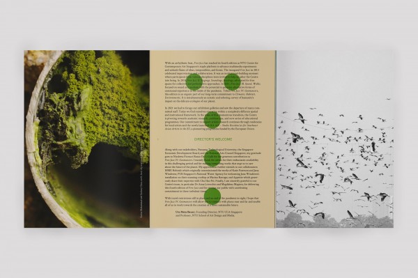
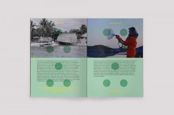
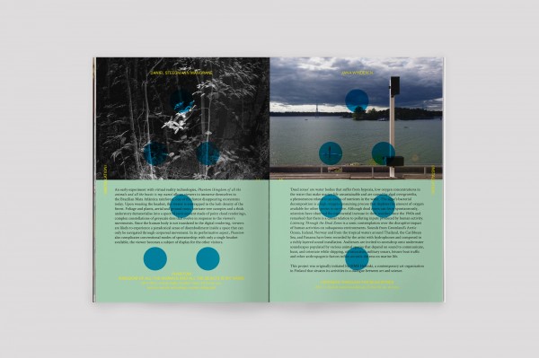
The exhibition Free Jazz IV. Geomancers marks the fourth installment of the Free Jazz series of performance and time-based interventions on- and off-site at NTU Centre for Contemporary Arts Singapore. Based on the ancient divination method of Geomancy, Free Jazz IV gathers an ensemble of artists trying to read the current state of the Earth, and concerned with future prospects of ecological collapse. For the accompanying Exhibition Guide and exhibition visuals, mono.studio used the symbols of Geomancy – a combination of eight dots in various formations – as a visual foundation and guiding thread.
/ Commissioned by / NTU Centre for Contemporary Art Singapore /
/ Artists / Martha Atienza, Ursula Biemann, Carolina Caycedo & David de Rozas, Chu Hao Pei, Liu Chuang, Pedro Neves Marques, Katie Paterson, Rice Brewing Sisters Club, Daniel Steegmann Mangrané, Jana Winderen, Zarina Muhammad & Zachary Chan, and Robert Zhao Renhui /
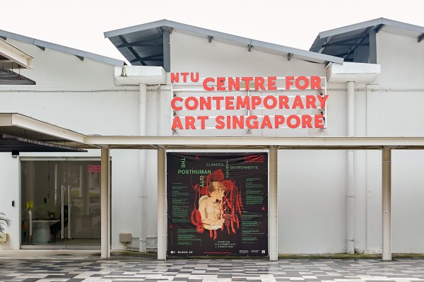

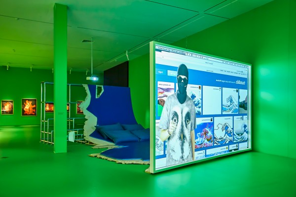
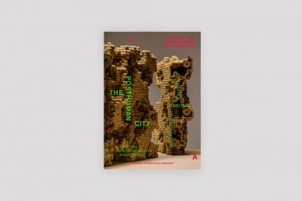
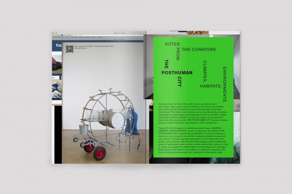
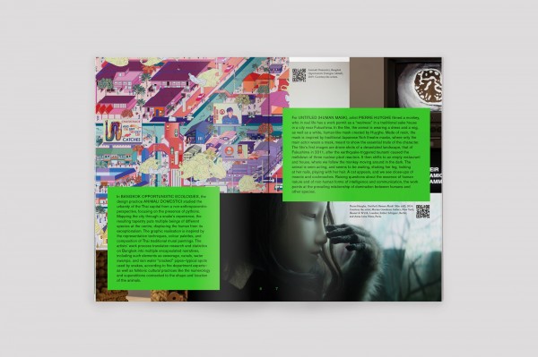
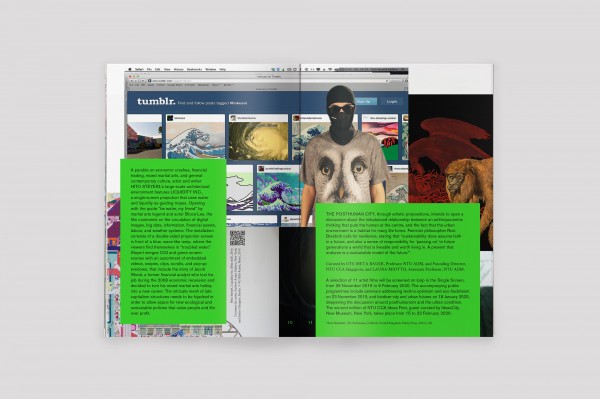
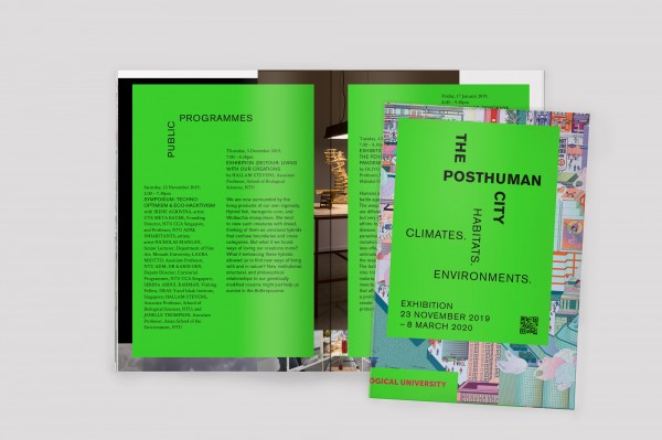
NTU CCA SINGAPORE / THE POSTHUMAN CITY
/ ART DIRECTION / DESIGN /
The exhibition The Posthuman City concerns itself with the phenomenon of global urban growth and the pressures it creates on natural resources and habitats. For the exhibition’s identity, we proposed a visual overload, mirroring urban density and the metropolitan palimpsest of information, sight, sound, movement. The layers are structured by a gridded title typography running nowhere, and a toxic, sickening neon green, which found its way into the Exhibition Hall as a glaring backdrop to underline the urgency of the artworks.
/ Commissioned by / NTU Centre for Contemporary Art Singapore /
/ Artists / Irene Agrivina, Animali Domestici, Pierre Huyghe, Ines Doujak, Jae Rhim Lee, Lucy + Jorge Orta, Nicholas Mangan, Marjetica Potrc, Hito Steyerl /
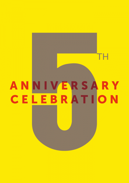
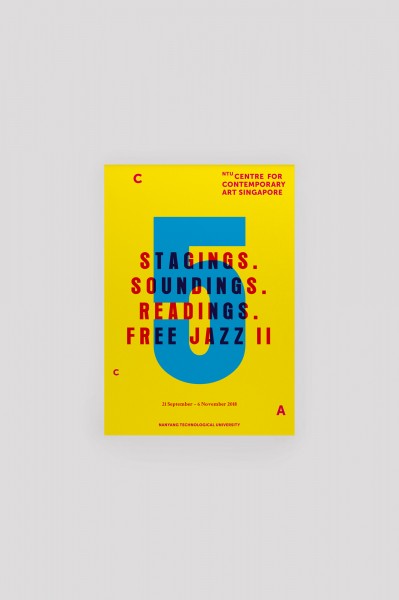
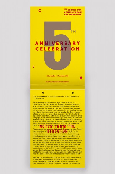
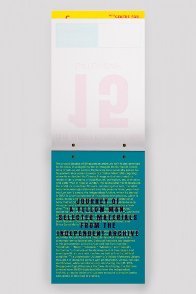
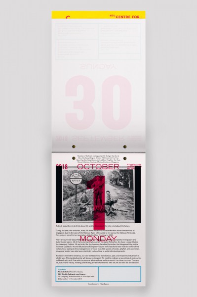
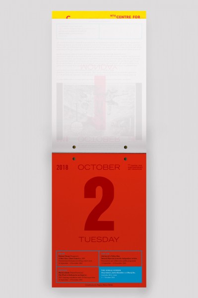
NTU CCA SINGAPORE / STAGINGS. SOUNDINGS. READINGS. FREE JAZZ II
/ ART DIRECTION / DESIGN /
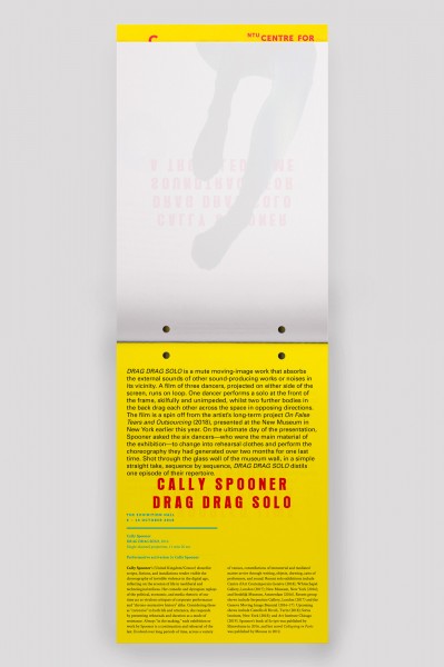
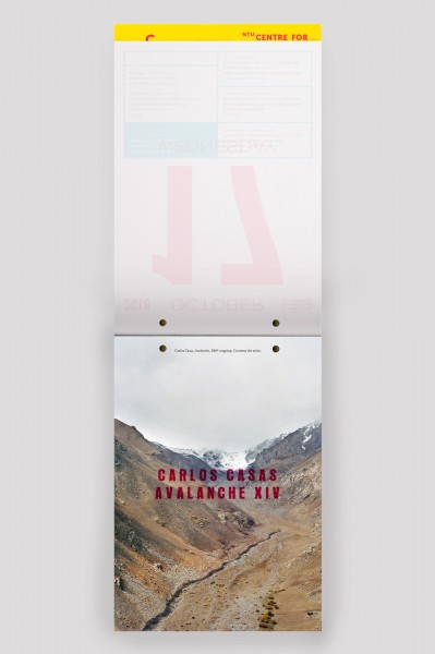
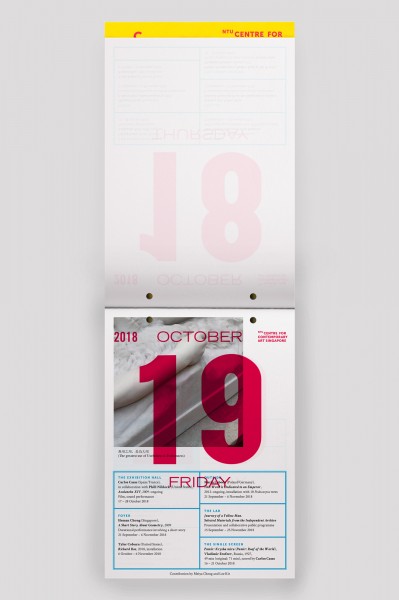
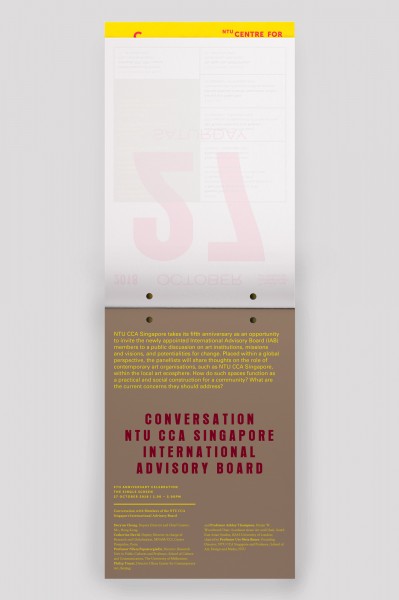
The exhibition Stagings. Soundings. Readings. Free Jazz II revisits the NTU CCA Singapore’s inaugural event, in celebration of its 5th anniversary. As the Free Jazz series is dedicated to time-based and performative arts, while also marking a specific point in time in the institute’s history, we honoured the occasion with a publication in form of a Chinese tear-off wall calendar, functioning as a schedule to the series of events over several months, while also becoming a performative act in itself. In addition, artists and writers attached to the institute created specific contributions for the daily pages.
/ Commissioned by / NTU Centre for Contemporary Art Singapore /
/ Artists & Contributors / Carlos Casas and Phill Niblock, Heman Chong, Tyler Coburn, Luke Fowler, Anton Ginzburg, Maria Loboda, Boris Nieslony, Cally Spooner, Alexandra Pirici, Kelly Reedy, Anca Rujoiu, Justin Shoulder and Bhenji Ra, Mariana Silva, Peter Sipeli and 1angrynative, Lee Wen, Ming Wong /
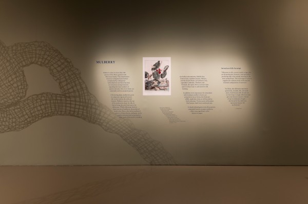
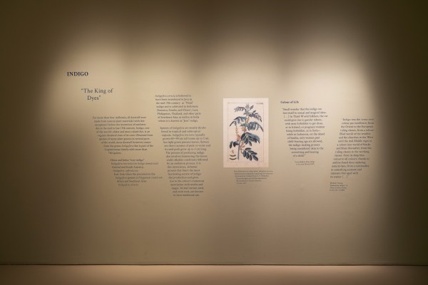
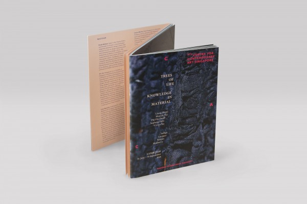
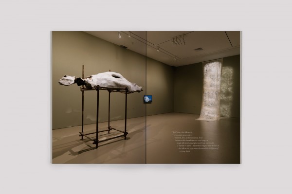
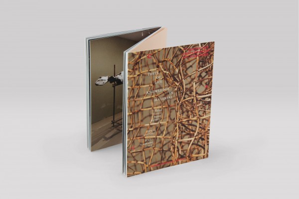
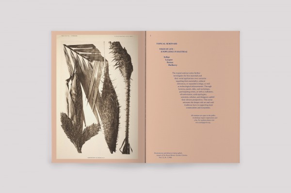
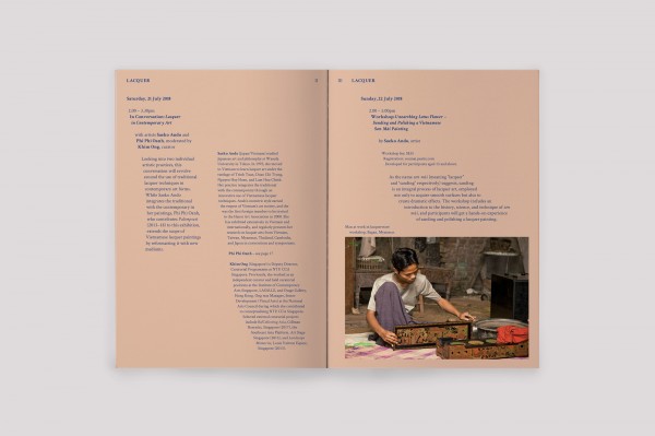
NTU CCA SINGAPORE / TREES OF LIFE – KNOWLEDGE IN MATERIAL
/ ART DIRECTION / DESIGN /
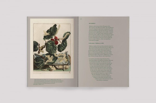
The exhibition Trees of Life – Knowledge in Material forms an inquiry into four plants deeply rooted in Asia: indigo, lacquer, rattan, and mulberry. It explores their biological knowledge as well as their social, geopolitical, and historical contexts, in the shape of an exhibition accompanied by topical seminars and workshops, combining scientific research with artistic practice. For the identity, we straddled the divide between the artistic and scientific sides of the exhibition, following nature’s organic and seemingly uncontrolled growth by letting the typography quite literally flow and spread across the pages, posters, and walls.
/ Commissioned by / NTU Centre for Contemporary Art Singapore /
/ Artists / Liang Shaoji, Manish Nai, Phi Phi Oanh, Sopheap Pich, Vivian Xu /
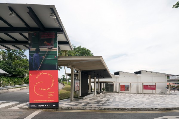
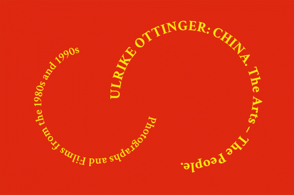
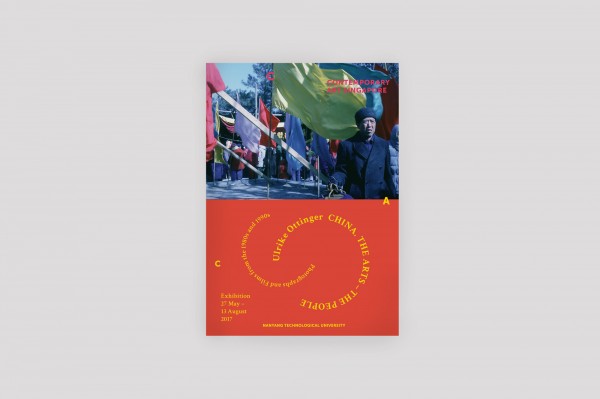
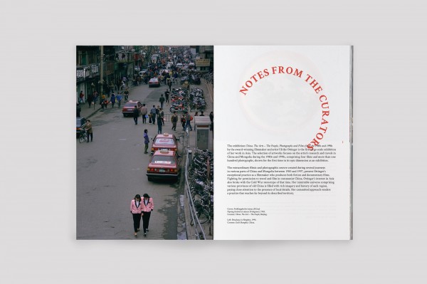
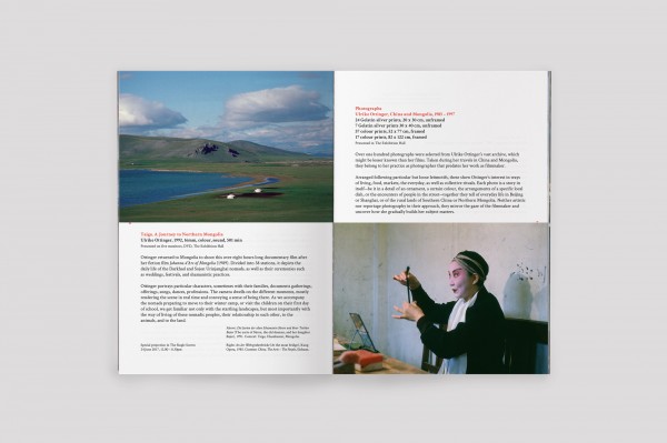
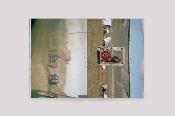
NTU CCA SINGAPORE / ULRIKE OTTINGER: CHINA. THE ARTS – THE PEOPLE
/ ART DIRECTION / DESIGN /
The exhibition ‘Ulrike Ottinger: China. The Arts – the People’ consists of a series of photographs and films taken during the artist’s extensive travels throughout China and Mongolia in the early 1980s, at a time when China in particular was on the brink of transitioning from Mao’s reign into modernity. Accordingly, we treated the central Exhibition Guide like a souvenir booklet, with the artworks unfolding like a set of tourist postcards from a country at a different time and place. While the circular typography is inspired by classic Chinese imagery of dragons, the colour scheme references the Chinese flag.
/ Commissioned by / NTU Centre for Contemporary Art Singapore /
/ Artist / Ulrike Ottinger /
day that calls for beautifully melancholic consolation or else, active opposition, for instance by showing off a little colour. /
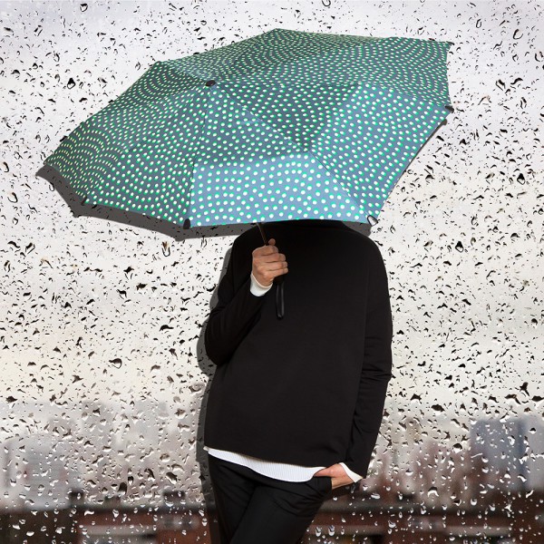
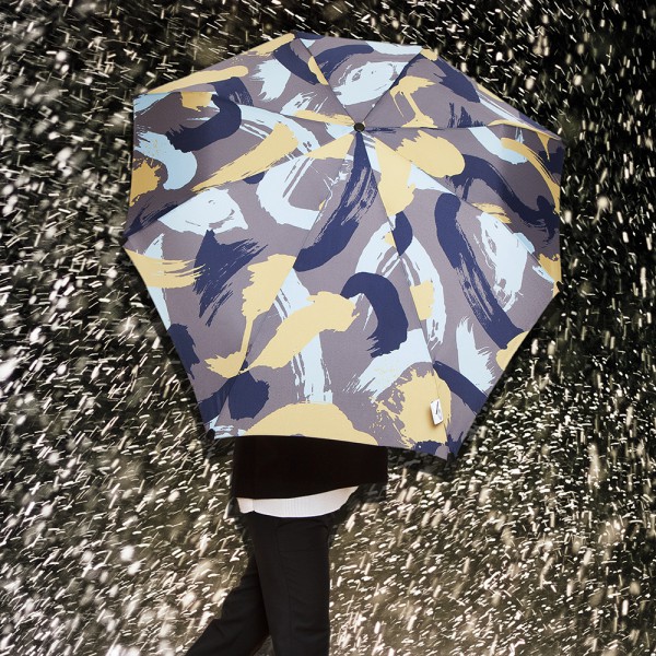
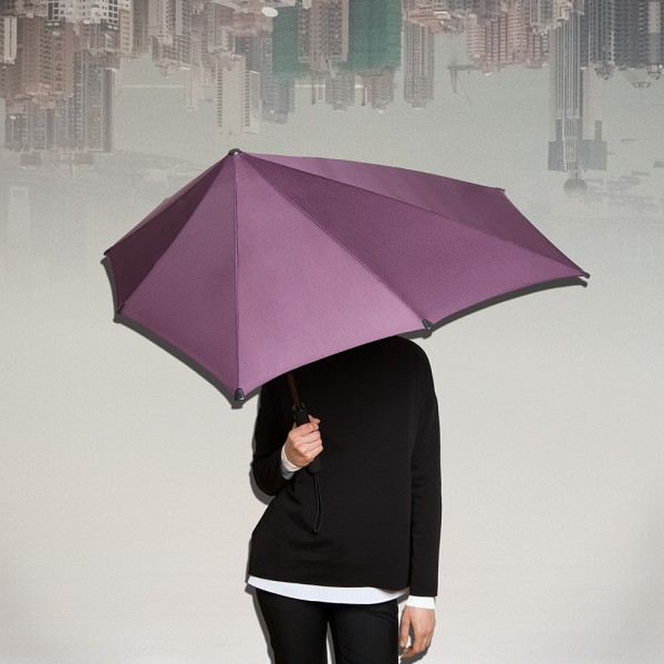
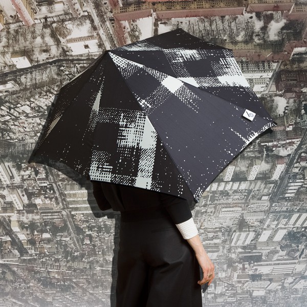
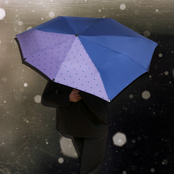
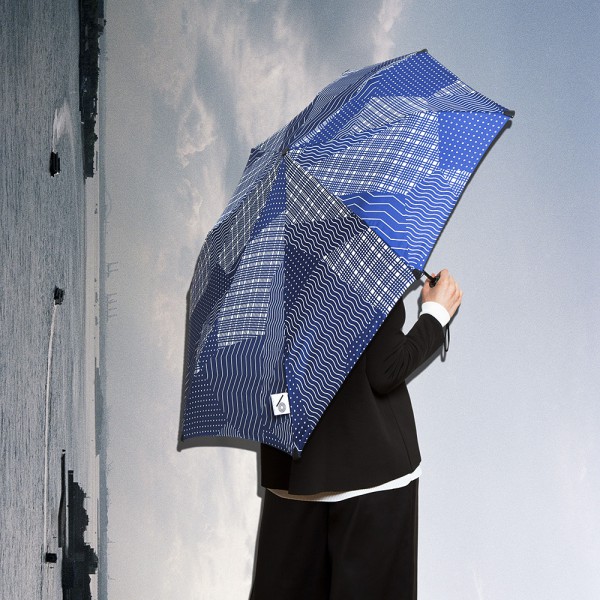

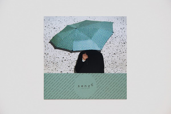
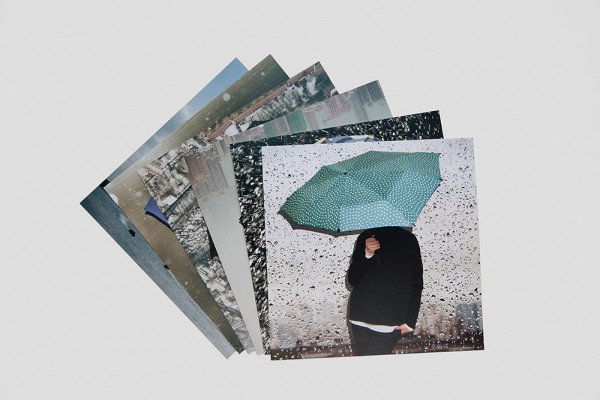
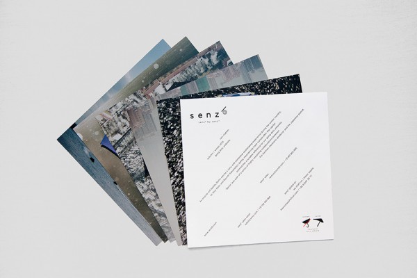
SENZ6 / AUTUMN WINTER 2015 / IMAGE CAMPAIGN & LOOKBOOK
/ ART DIRECTION / CONCEPTION / PRODUCTION / TEXT / DESIGN / PHOTOGRAPHY /
Dutch design company senz° have reinvented the umbrella as we know it: redesigning its basic shape along the the laws of aerodynamics and refining countless little details, senz° umbrellas are storm-proof and strikingly handsome.
For its new and fashionable offspin senz6, mono.studio revised the brand’s approach to their image campaign and lookbook. We developed a contemporary language for the product images by merging urban landscapes and fashion imagery into dizzying photocollages.
The collection’s theme of ‘Rain Rhythm’ was reflected in the typography and gracing each umbrella with its own individual soundtrack for rainy afternoons.
/ Commissioned by / senz° /
/ Creative Direction / Yosuke Nishiumi /
/ Styling / Kamilla Richter /
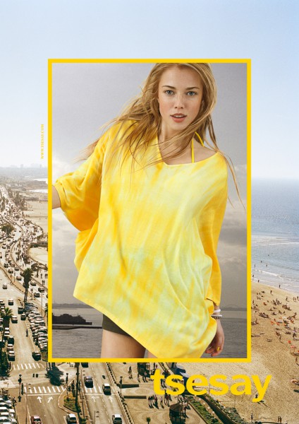
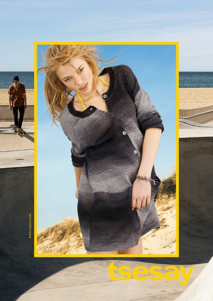
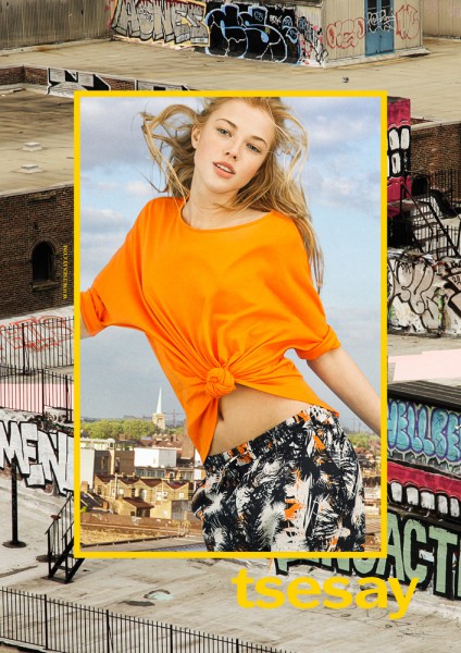
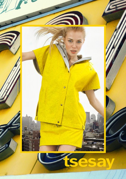
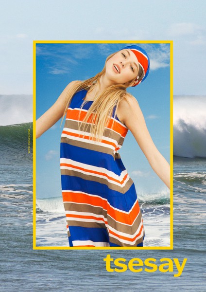
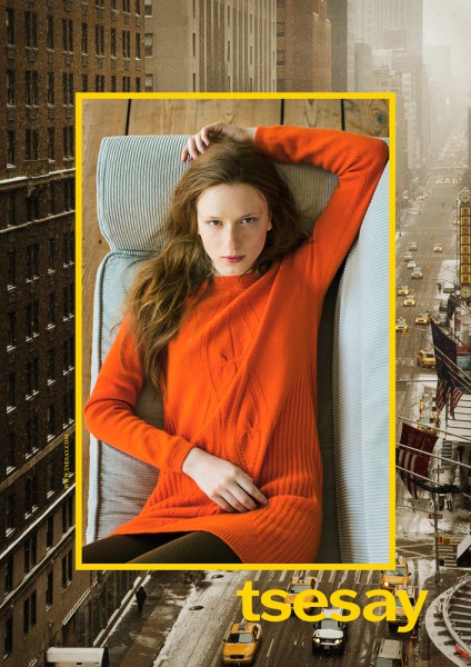
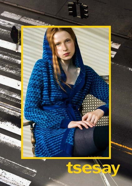
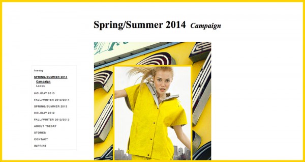
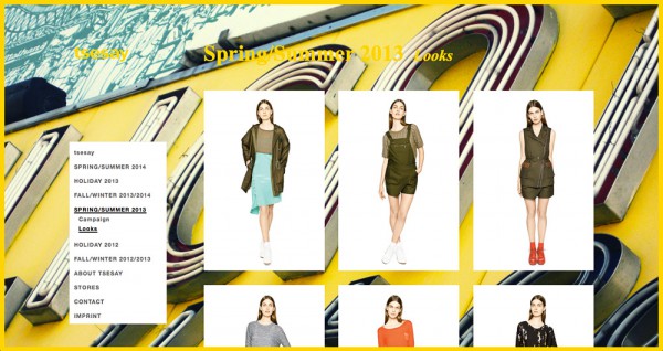
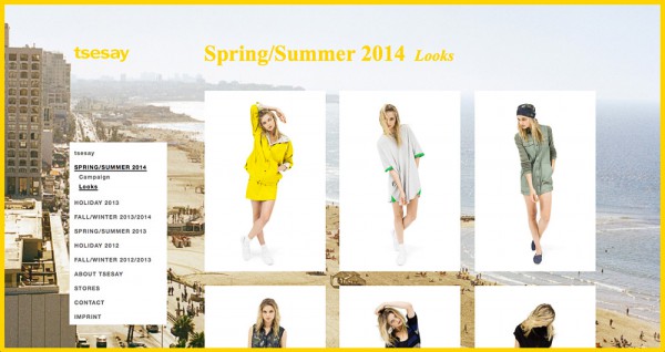
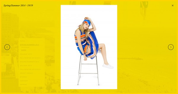
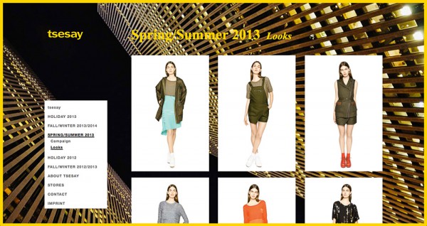
TSESAY / SPRING SUMMER 2014 / CAMPAIGN
/ ART DIRECTION / CONCEPTION / PRODUCTION / DESIGN / PHOTOGRAPHY /
For the New York womenswear label tsesay, mono.studio has conceived a new visual vocabulary, including their brand book, advertising campaigns, website, and promotional materials such as lookbooks and videos.
As part of our new advertising strategy for tsesay, mono.studio has developed a modular graphic system, juxtaposing fashion imagery against cityscapes of New York, to emphasise the urban essence of the brand while also generating an atmosphere specific to the theme of each collection. All background images were sourced through social media, actively engaging the younger audience of the label while bringing tsesay to street level – which is, after all, where it belongs.
The tsesay Spring/Summer 2014 collection was largely influenced by surf and skate culture, incorporating elements of beachwear and tie-dye techniques. Evoking a sense of lightness and joy, all fashion images were shot in full motion, while the background images unashamedly revel in that summer feeling.
/ Commissioned by / tsesay /
/ Styling / Syria Bellisario /
/ Hair & Makeup / Julie Skok /
/ Model / Michaela / Izaio /
/ Post Production / Uwe Arens /
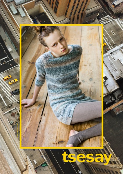
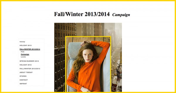
TSESAY / AUTUMN WINTER 2013 / CAMPAIGN
/ ART DIRECTION / CONCEPTION / PRODUCTION / DESIGN /
For the tsesay Autumn/Winter 2013 campaign, we introduced our modular design system that juxtaposes fashion imagery with the city. As it is a collection based on the concept of warmth, friendship and traditional values in turbulent times, we produced a warm and intimate fashion series in a private apartment, set against New York winter scenes with dramatic perspectives and graphic urban patterns. All background images were sourced through social media.
/ Commissioned by / tsesay /
/ Photography / David Fischer /
/ Styling / Syria Bellisario /
/ Hair & Makeup / Julie Skok /
/ Model / Dina / Izaio /

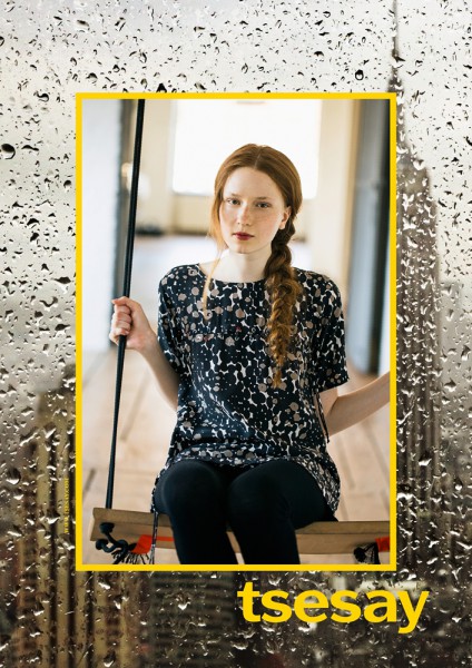
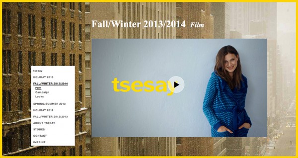
TSESAY / AUTUMN WINTER 2013 / VIDEO
/ ART DIRECTION / CONCEPTION / TEXT /
With the tsesay Autumn/Winter 2013 season designed around the ideas of warmth and protection, mono.studio complemented the print campaign with a promotional video on a more playful note, conceived as a light-hearted glimpse into New York winter life. Striking a healthy balance between body and soul, between inside and outside, is essential, and maybe even more so during the cold months.
/ Commissioned by / tsesay /
/ Production & Editing / The Screeners /
/ Photography / Kaspar Köpke /
/ Styling / Syria Bellisario /
/ Hair & Makeup / Julie Skok /
/ Model / Ida / M4 /
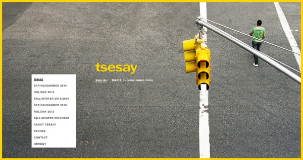
TSESAY / WEB SITE
/ ART DIRECTION / DESIGN / TEXT /
For the launch of www.tsesay.com, mono.studio developed an intuitive and dynamic internet presence based on the idea of versatility for an urban life in flux. The website is refreshed season to season with the New York imagery of the latest advertising campaign, and thus regularly updated in its appearance while maintaining its underlying navigation and structure. Needless to say, the scrolling site makes use of the latest web technology, integrating responsive design adapted to tablets and smartphones.
/ Commissioned by / tsesay /
/ Additional Art Direction, Design & Programming / Christian Frey /
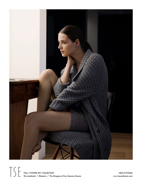
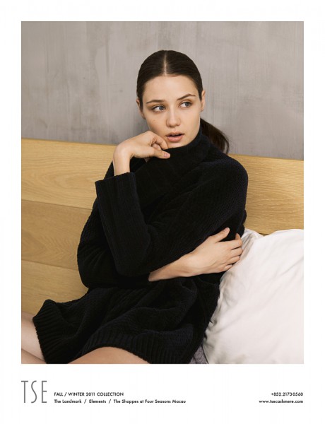
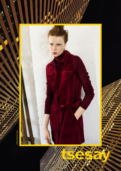
TSE / AUTUMN WINTER 2011 / CAMPAIGN
/ ART DIRECTION / CONCEPTION / DESIGN / PHOTOGRAPHY /
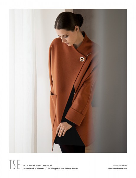
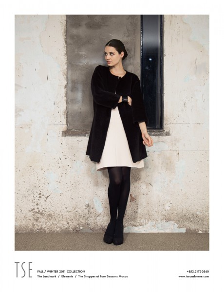
Tse is a New York label renowned for its classic yet modern knitwear designs. Ever since Hussein Chalayan’s tenure as Creative Director in the 1990s, the label has consistently explored what can be done with cashmere for today’s needs without losing sight of its roots.
Consequently, for a special Autumn/Winter 2011 print campaign directed primarily at the Asian market, mono.studio developed a story depicting a private moment of quiet between public and personal time, between day and night, between work and leisure. For cashmere is luxury, and real luxury is an intimate pleasure.
/ Commissioned by / Tse /
/ Hair / Nic Chau /
/ Makeup / Michael Fei /
/ Model / Ashleigh / Elite /
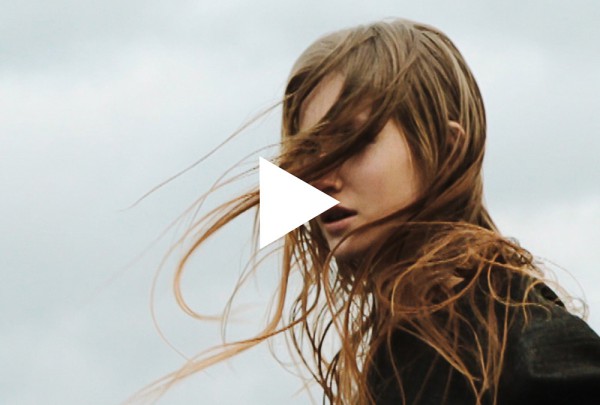
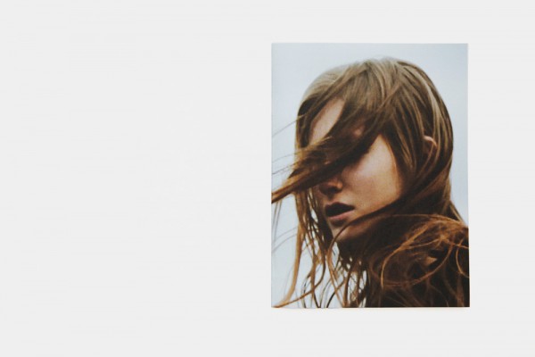
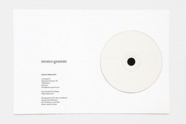
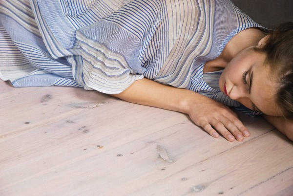
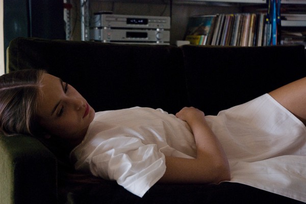
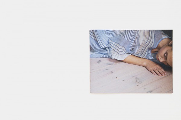
MONO.GRAMM / AUTUMN WINTER 2012 / VIDEO & LOOKBOOK
/ ART DIRECTION / PRODUCTION / DESIGN / PHOTOGRAPHY /
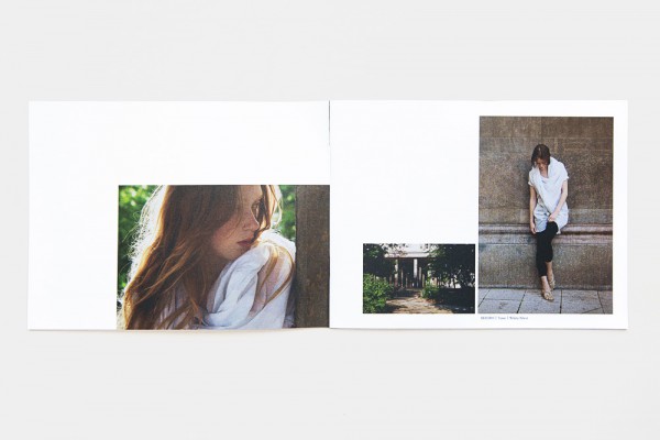
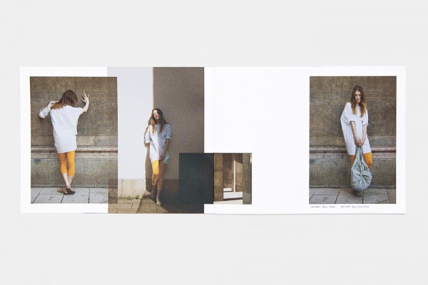
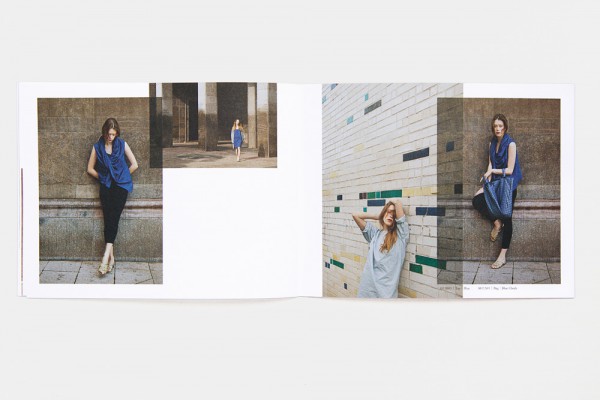
Since 2009, mono.studio has been providing art direction and consulting for our associated womenswear label mono.gramm, producing accompanying lookbooks for eight seasons, videos, the website, and a photographic launch exhibition in London. mono.gramm’s signature designs are seemingly effortless and easily accessible, but effectively developed from highly unusual drapings and patterns. Over the years, mono.gramm perfected a style that sits comfortably between the casual and the elegant, between simplicity and unexpected complexity.
Similarly, we defined a visual approach that was firmly grounded in casual photography, eschewing overproduced fashion fantasies. Instead, we searched for unforced images of personal and everyday moments, creating a sense of atmosphere, intimacy, and natural beauty.
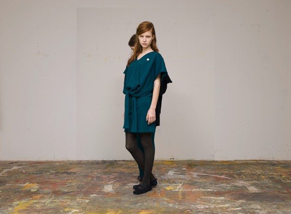
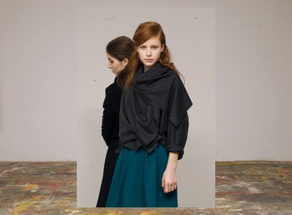
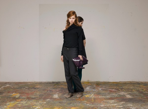
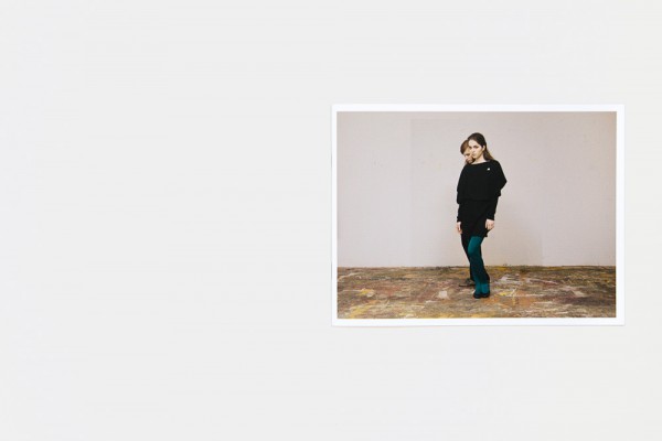
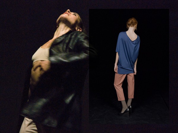
The Autumn/Winter 2012 collection brought various elements from previous collections to a point with exceptional ease – particularly each garment’s surprising versatility in function and shape. We produced a celebratory video as a bittersweet counterpoint to winter’s greyness. Little did we know at the time that this film would mark a swan song of sorts, as mono.gramm went into temporary hibernation to rethink its place in a rapidly changing industry. To be continued.
/ Styling / Syria Bellisario /
/ Hair & Makeup / Julie Skok /
/ Model / Amélie / Seeds /


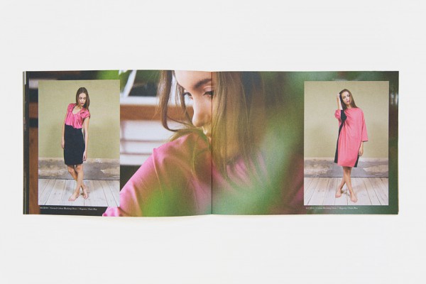
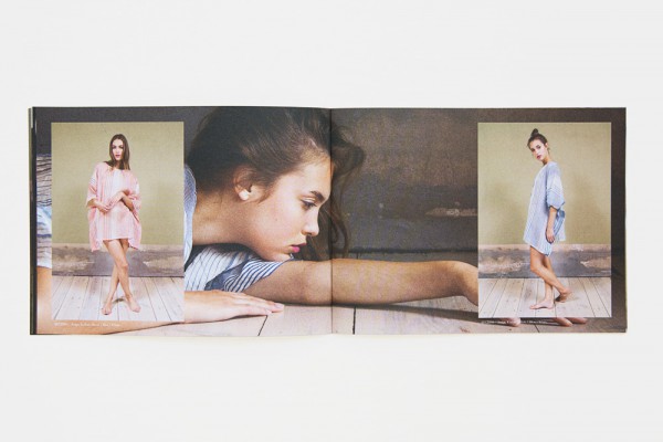
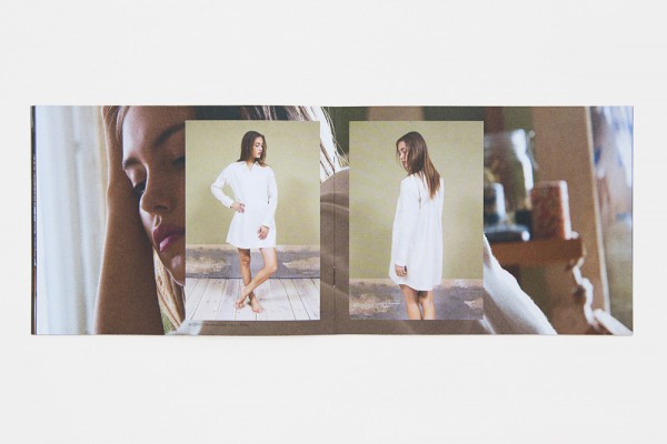
MONO.GRAMM / SPRING SUMMER 2012 / LOOKBOOK
/ ART DIRECTION / DESIGN / PHOTOGRAPHY /
For Spring/Summer 2012, mono.gramm toyed with ‘borrowing’ your boyfriend’s clothes, developing an entire collection of dresses and tops from the classic men’s button-down shirt. Taking the idea to its logical end, for the lookbook we imagined an idle day of blissfully killing time at home, in a state of careless dress, waiting for the summer heat to ease.
/ Styling / Syria Bellisario /
/ Hair & Makeup / Julie Skok /
/ Model / Kiki / Seeds /
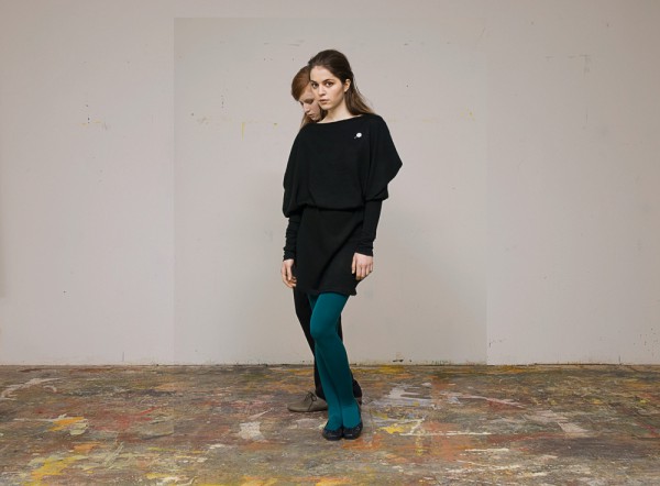
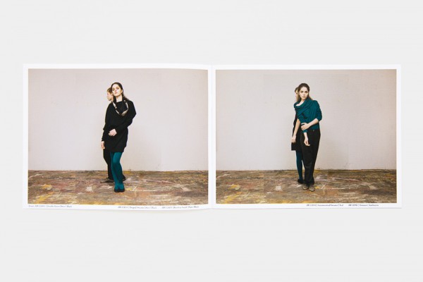
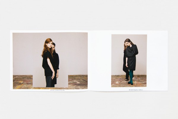
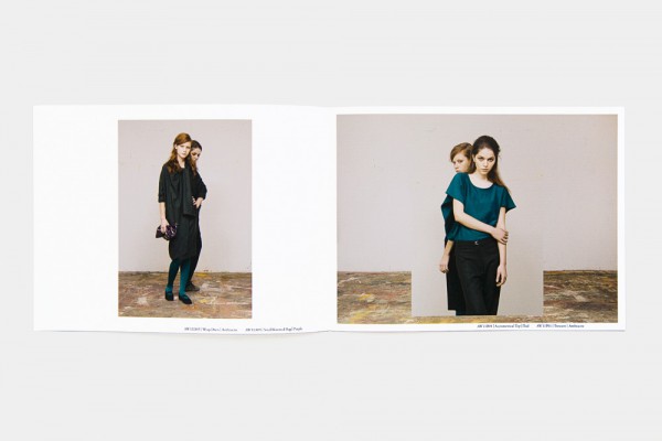
MONO.GRAMM / AUTUMN WINTER 2011 / LOOKBOOK
/ ART DIRECTION / DESIGN / PHOTOGRAPHY /
Versatility has always been an important element of mono.gramm, taken to its extreme in the Autumn/Winter 2011 season, with sleeves turning into belts, dresses being tied in many different combinations. Exploring the definitions of identity through clothing, we visually expanded the idea by generating unexpected silhouettes through the interplay of two models.
/ Hair & Makeup / Julie Skok /
/ Models / Helen / Mega & Pepa / M4 /
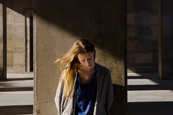
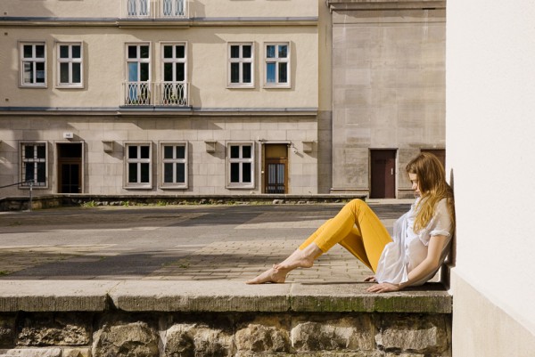
MONO.GRAMM / SPRING SUMMER 2011 / LOOKBOOK
/ ART DIRECTION / DESIGN / PHOTOGRAPHY /
mono.gramm’s Spring/Summer 2011collection is dedicated to that particular sensation of spending summer days in the city. There is no shame in taking inspirations literally when they are so rich in memories and associations, so we surrendered to a perfectly hot summer day around Berlin’s famed Karl-Marx-Allee to gather a kaleidoscopic selection of fragments and moments for the lookbook.
/ Hair & Makeup / Julie Skok /
/ Model / Elisa / Viva /
MONO.GRAMM / AUTUMN WINTER 2010 / LOOKBOOK
/ ART DIRECTION / DESIGN / PHOTOGRAPHY /
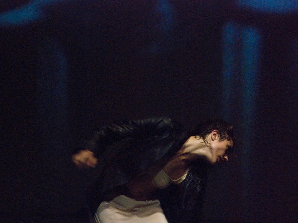
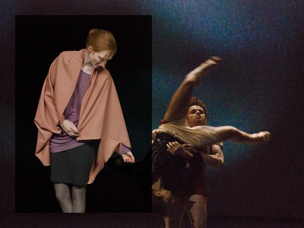
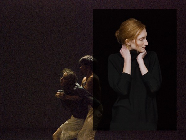
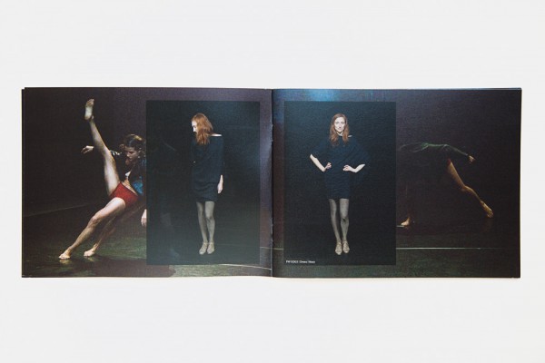
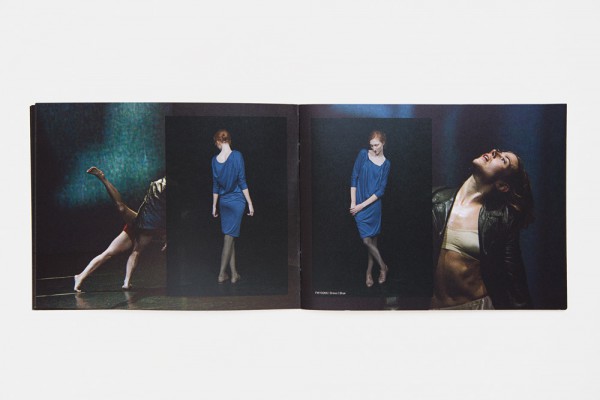
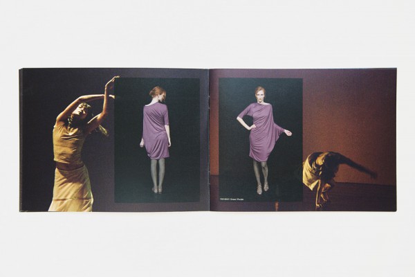
The Autumn/Winter 2010 collection by mono.gramm began with that most basic starting point: the human body. With the designs derived from impressions of dance and the body in motion, we juxtaposed the lookbook fashion images with expressive shots of dancers in full swing, creating a dark and explosive contrast between stillness and vibrancy.
/ Styling / Saskia Schmidt /
/ Hair & Makeup / Julie Skok /
/ Model / Anna / Seeds /
/ Dance / Cie. Toula Limnaios /

MONO.GRAMM / SPRING SUMMER 2010 / LOOKBOOK
/ ART DIRECTION / DESIGN / PHOTOGRAPHY /
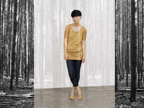
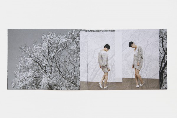
Organic and gentle drapings and prints defined the mono.gramm Spring/Summer 2010 season. We developed this concept further for the lookbook, overprinting the fashion images on black & white landscape scenes, like a gust of wind rippling through the folds of your shirt.
/ Hair & Makeup / Julie Skok /
/ Model / Nicole / Seeds /

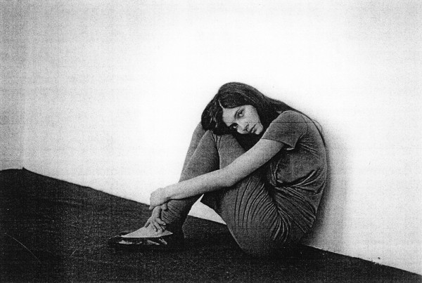
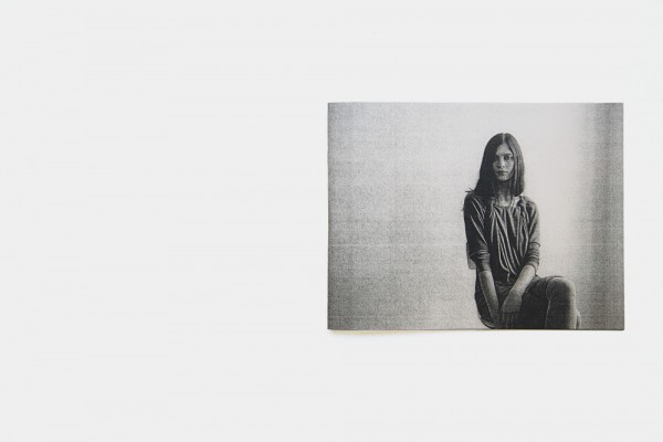
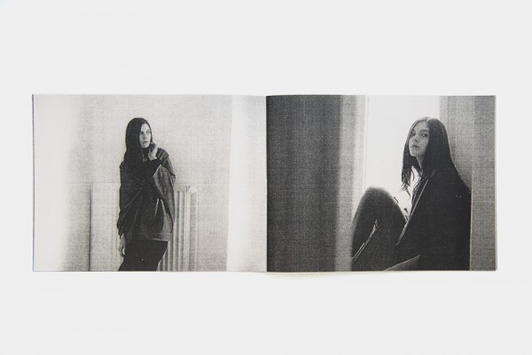
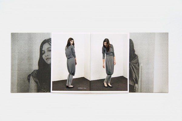
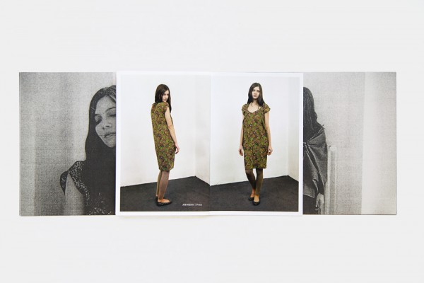
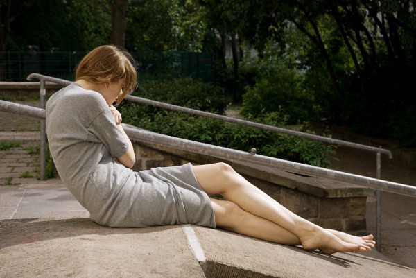
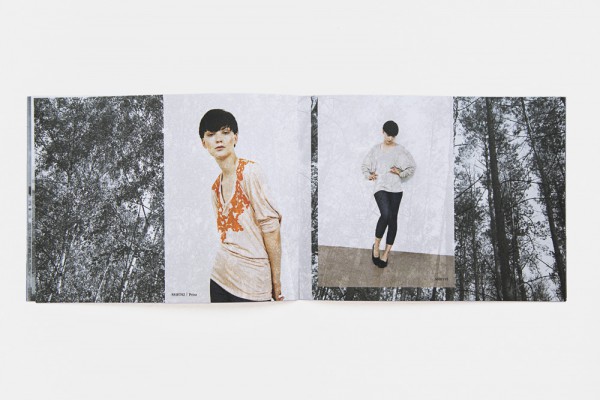
MONO.GRAMM / AUTUMN WINTER 2009 / LOOKBOOK
/ ART DIRECTION / DESIGN / PHOTOGRAPHY /
mono.gramm’s offering for Autumn/Winter 2009 combined the signature elements of twisted and organic silhouettes with soft jersey fabrics and subdued shades of grey. Consequently, like the collection, the lookbook is an exercise in reduction, opting for distorted black & white imagery set against sparse moments of colour.
/ Model / Kathlen / M4 /
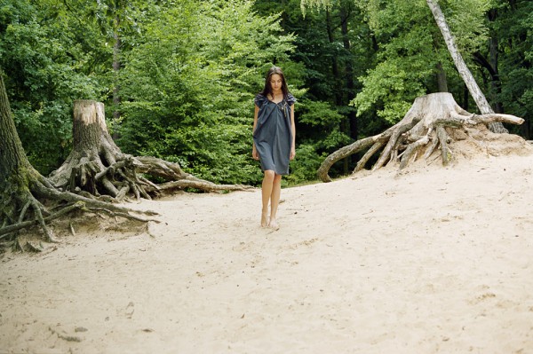
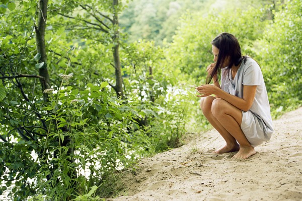
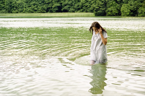
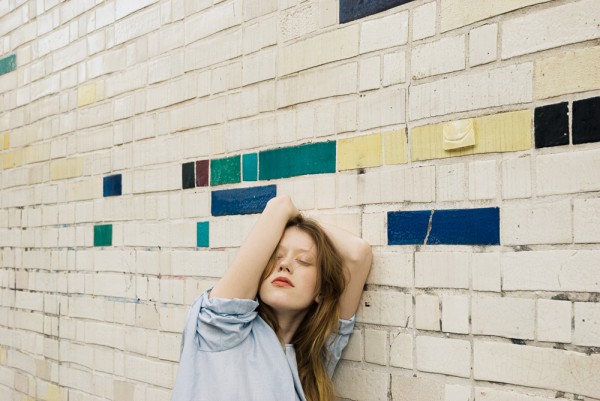
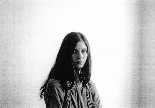
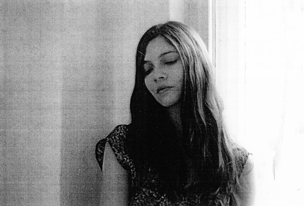
MONO.GRAMM / SPRING SUMMER 2009 / LOOKBOOK
/ ART DIRECTION / DESIGN / PHOTOGRAPHY /
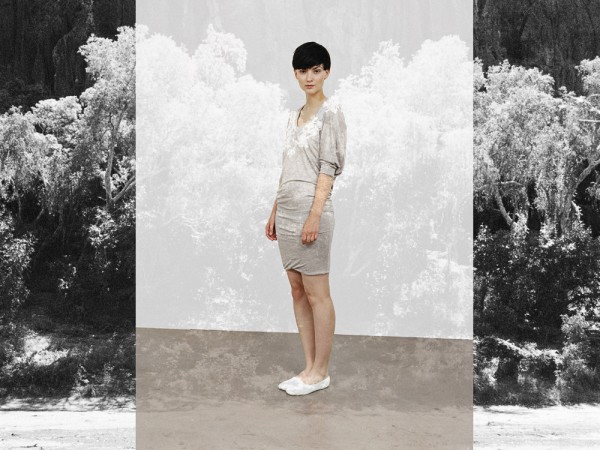
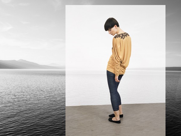
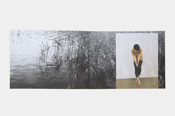
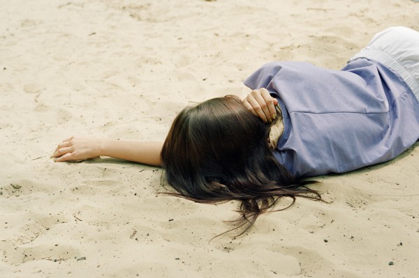
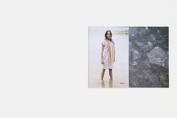
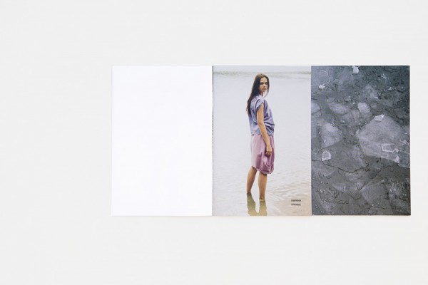
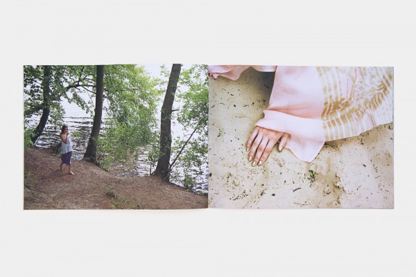
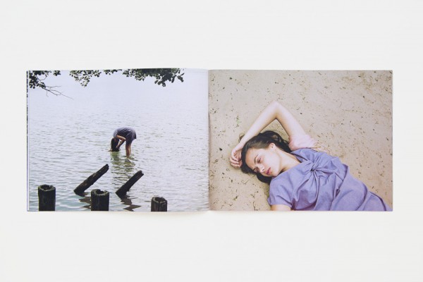
Spring/Summer 2009 marked the first season of mono.gramm, and defined a clarity in design to become the label’s signature style: a collection of dresses only, twisting men’s shirting fabrics into organic and flowing silhouettes. Natural forms have always been an essential reference point for mono.gramm, so it seemed equally natural to indulge ourselves with a day out in the countryside, by the lake, for the first lookbook. The images generated a light, effortless, yet intimate impression that would set the tone for all collections to follow. Water, sand, trees, air – what else do we need when life is so magnificent.
/ Model / Ludmilla / Seeds /